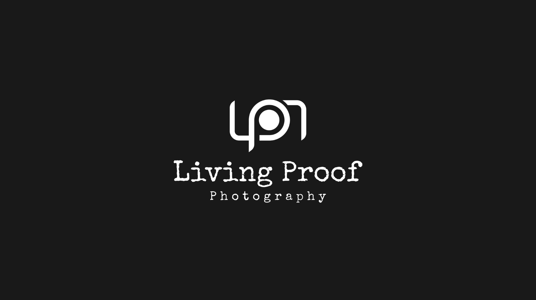
Living Proof Photography
Identity for a photography studio with the colour system doing the work
Logo and brand identity for Living Proof Photography. The mark sits inside a structured colour system where each variation has a defined purpose, with design principles that govern application across print and digital.
System
A photography brand competes on visual judgement. The identity had to hold its own next to the work it sat on top of without taking attention away from it. The result is a restrained mark in a flexible colour system.
Colour as structure
Each colour variation has a defined purpose, not a decorative one. The palette is tied to the brand’s personality and acts as the structural element that carries identity from the website through to client deliverables.
Outcome
A studio brand that frames the work without competing with it.