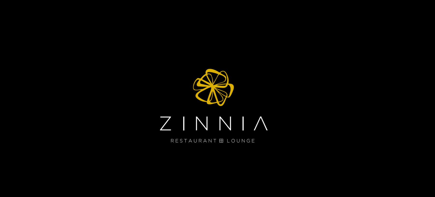
Zinnia Restaurant
Restaurant identity built around a single, immutable wordmark
Logo system and brand guide for Zinnia, a hospitality brand whose visual language was set entirely by the primary wordmark. Multi-colour logo iterations, mockup proofs, and a full brand reference in one sprint.
Brand foundation
The primary wordmark sits at the centre of Zinnia’s identity. It is the single, locked element the rest of the system answers to — every colour iteration, lockup, and application is derived from it without alteration.
Colour and application
Logo iterations were built for light, dark, and accent backgrounds so the brand reads consistently across signage, menus, packaging, and digital surfaces. Mockup proofs were produced in-system so the team could see the identity in real environments before approval.
Outcome
Zinnia walked out of the sprint with a documented logo system, a usable brand guide, and a complete mockup library — enough to launch the venue’s visual presence end-to-end.