
Branding for AI and tech startups: how to look as credible as your technology
Brand an AI or tech startup by making the technology legible, the category clear, and the proof obvious. Here's the playbook we use on every build.
Brand an AI or tech startup by making the technology legible, the category obvious, and the proof impossible to miss. The brand’s job is to translate something abstract into something a customer can trust before they understand the math, and to do it in the language of the buyer rather than the engineer.
That sounds simple. It almost never is, because the founders building the best technology are usually the worst positioned to explain it. They know too much. The brand has to carry the explanation for them.
Why AI startups have a credibility problem before they have a product problem
The hard part is not the model. It is convincing a buyer that an unfamiliar system deserves their data, their budget, and their reputation. AI tools ask for an unusual amount of trust. You want me to route my customer support through this? Underwrite my crop yield with it? Let it draft what my brand says? That is a big ask from a logo that looks like it was made in an afternoon.
We see the same pattern across branding for AI and tech startups: the demo is excellent, the deck is dense, and the brand undercuts both. A generic gradient, a name nobody can spell, three competing fonts. The product earns trust in the meeting and the brand quietly spends it back. Closing that gap is most of the work.
How do you brand a category that doesn’t exist yet?
You name the problem before you name the product. When the category is new, buyers have no mental shelf to put you on, so the brand has to build the shelf first. Lead with the pain the customer already feels, then position the technology as the obvious answer to it.
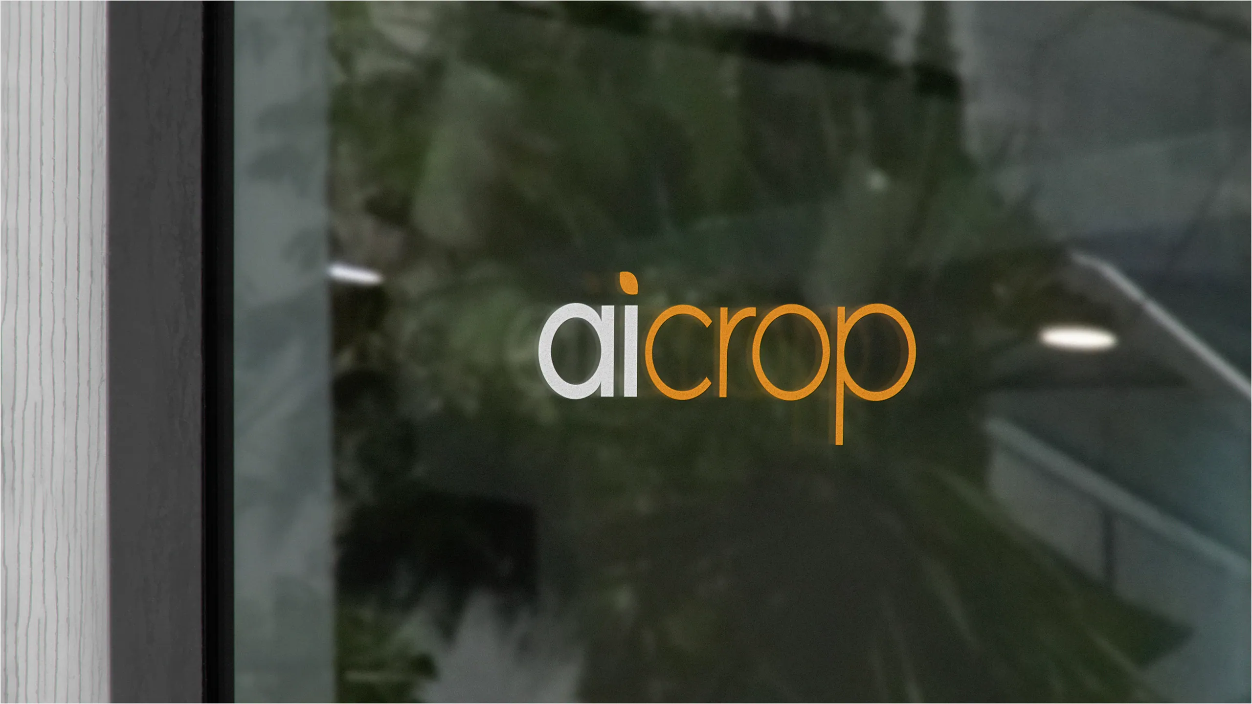
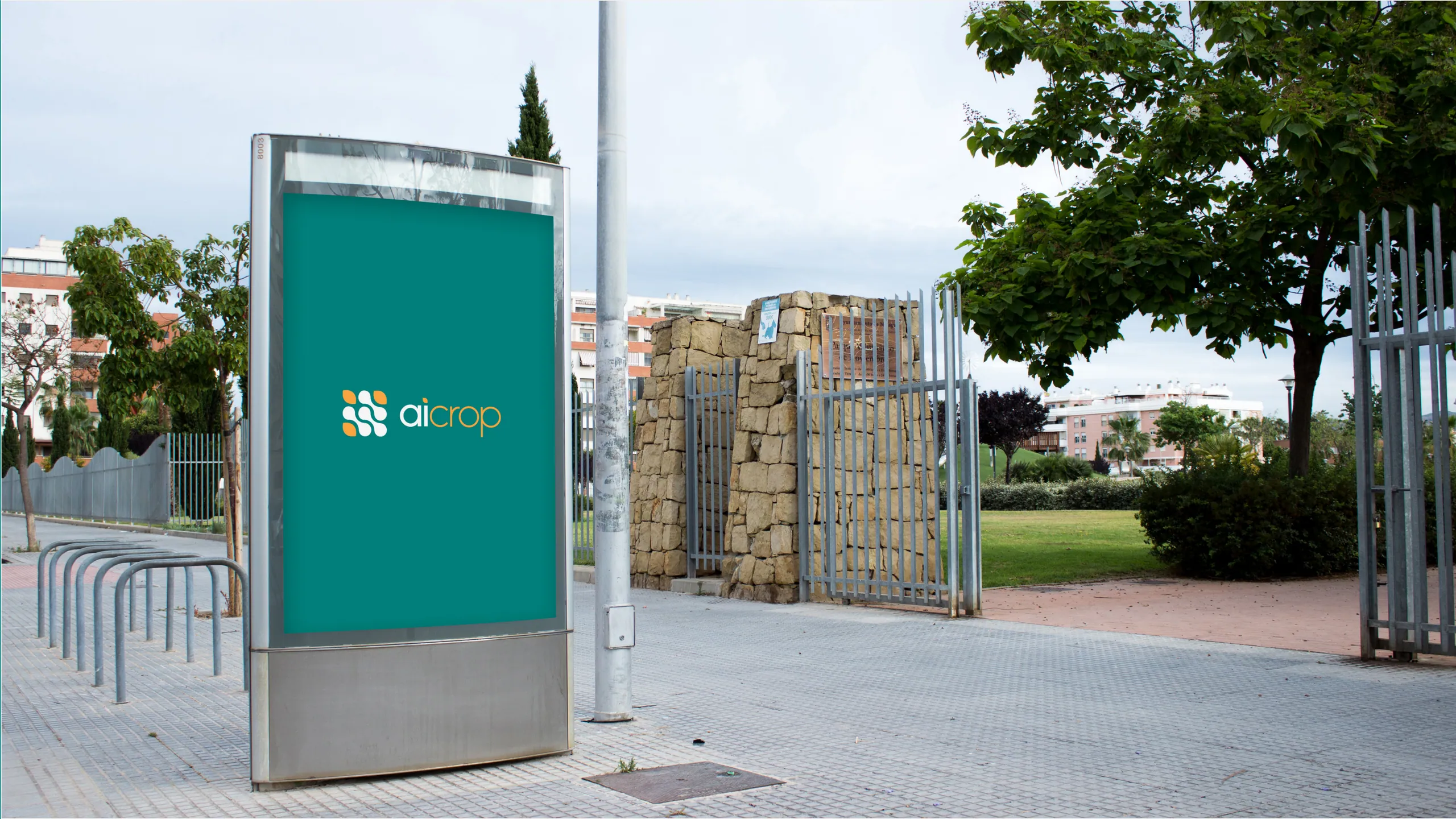
AiCrop sat in exactly this spot. Agricultural AI is real, but most farmers were not searching for it by name. The brand had to lead with the outcome a grower understands, yield and risk, and let the AI sit underneath as the mechanism. The identity used the visual language of the field, not the lab, so the technology felt like a tool a farmer would reach for rather than a science project aimed at them.
The mistake here is branding the breakthrough instead of the buyer. Your model architecture is fascinating to you and irrelevant to the person signing the contract. Anchor the brand in their world and let the novelty become a reason to choose you, not a reason to hesitate.
How do you make complex technology legible?
Pick one idea the brand stands for and let everything else support it. Legibility comes from restraint. A complicated product needs a simple brand, because the product is already carrying the complexity. The identity should give the buyer one thing to hold onto.
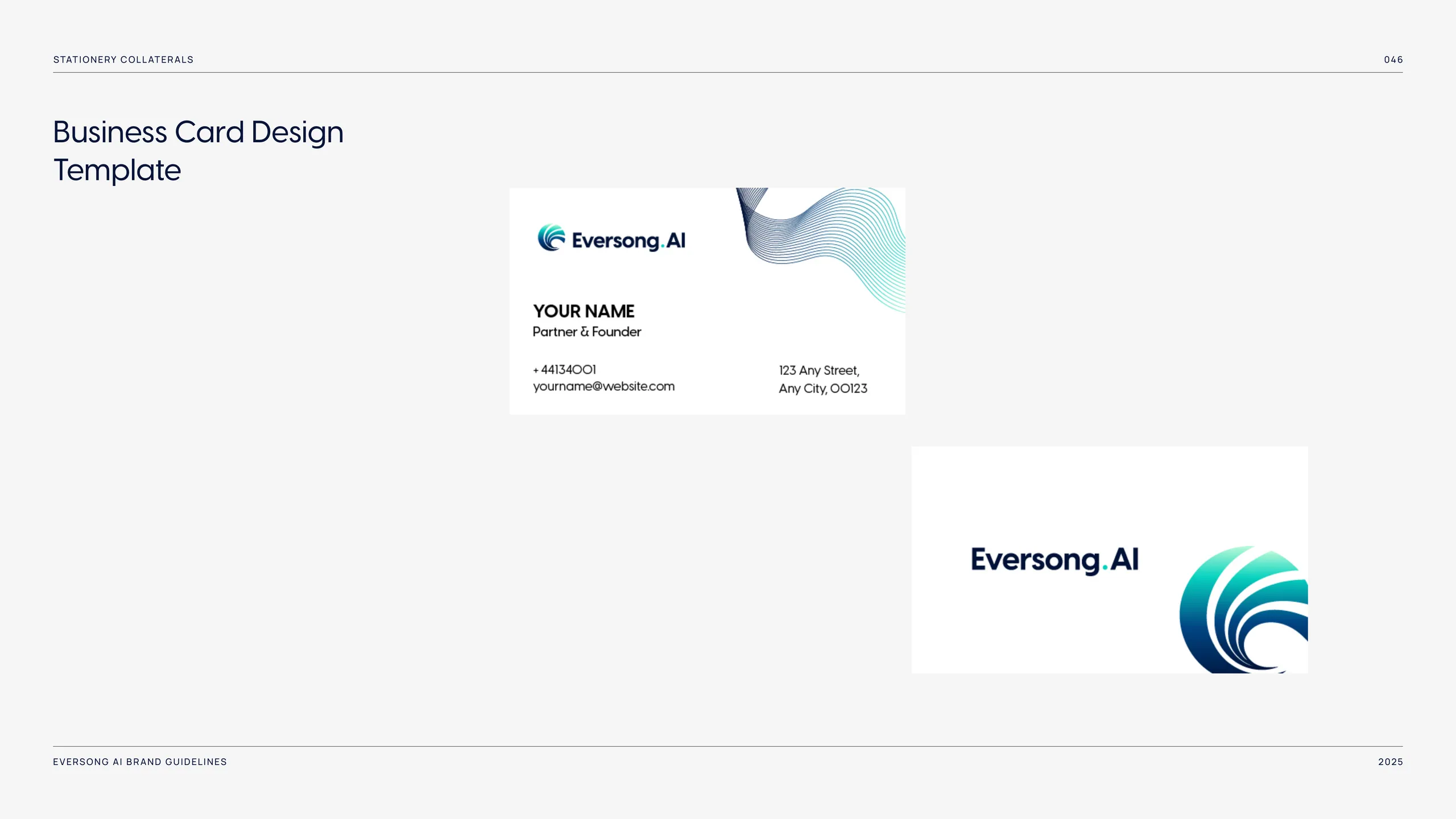
Eversong AI built its system around a single visual idea, a fluid wave mark that carried the sense of intelligence in motion. One idea, expressed consistently across the logo, the palette, and the way the site moved. The customer did not need to understand the architecture. They needed to feel that the thing was alive and coherent, and the brand delivered that in a glance.
Legibility is also a copy problem. The fastest way to lose a technical buyer is to describe your AI in the same inflated language every other tool uses. Say what it does, for whom, and what changes as a result. Concrete verbs beat visionary adjectives every time. If your homepage could describe a competitor without changing a word, the brand is not doing its job.
What does an investor-ready brand look like?
It looks like a company that already exists, not a project hoping to. Investors and enterprise buyers read the brand as a proxy for execution. A sharp, complete identity signals a team that finishes things. A patchwork one signals risk, regardless of how good the underlying technology is.
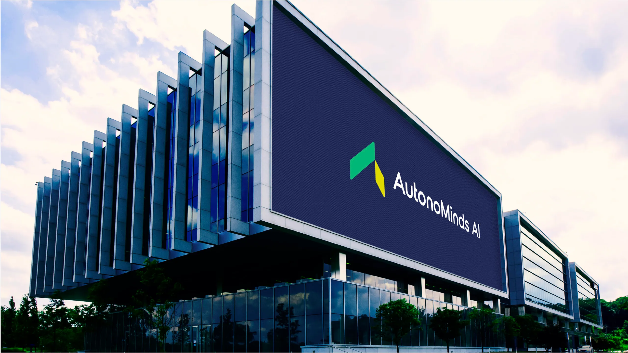
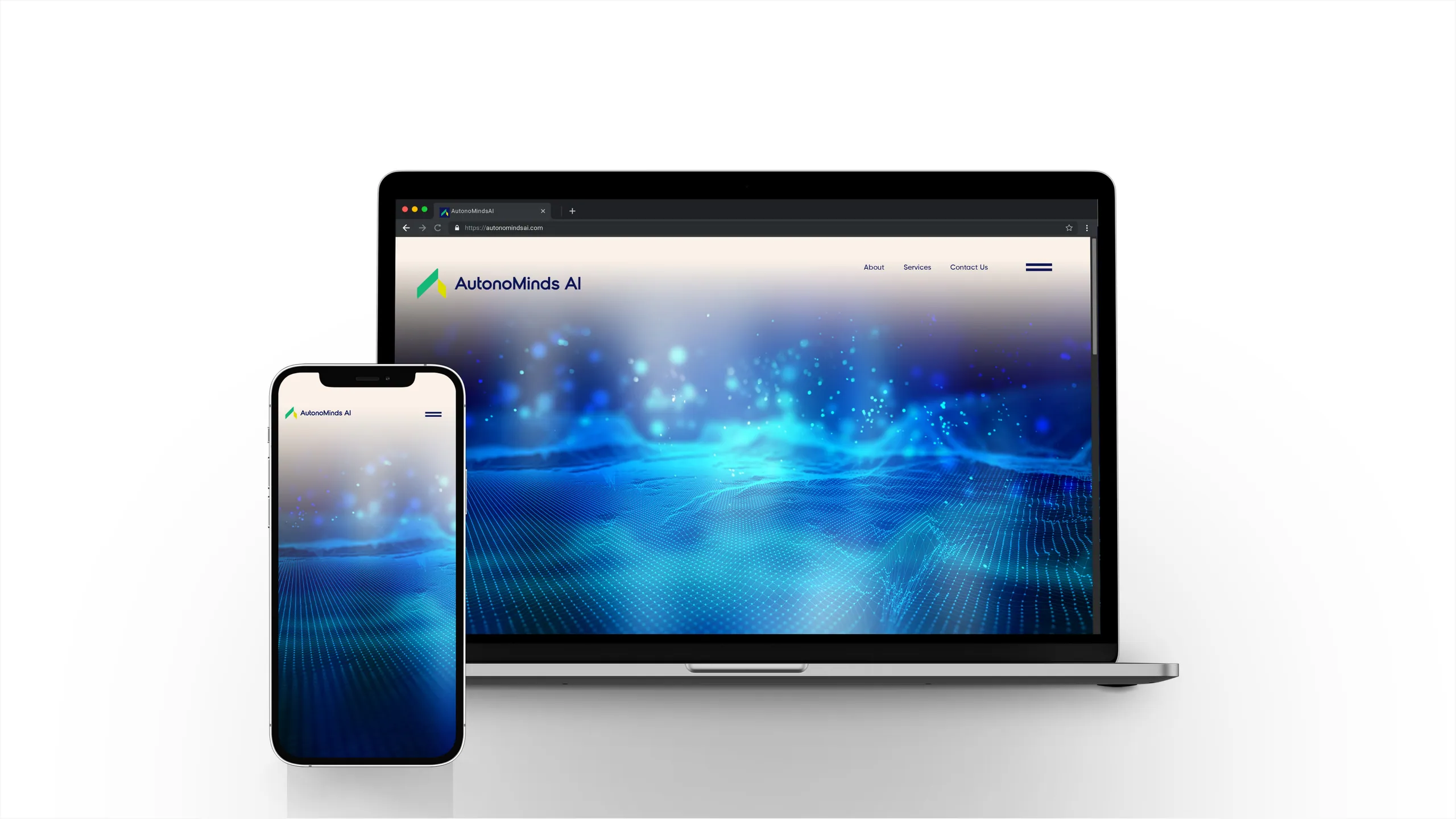
AutonoMinds AI is a useful reference for what complete looks like. The system ran from a custom logomark through a full palette, environmental signage, product mockups, and a pattern library rooted in neural and data-flow motifs. Every surface a stakeholder might touch was considered. That coherence is what reads as “ready” in a room where decisions get made fast and first impressions stick.
Investor-ready does not mean expensive-looking for its own sake. It means consistent, considered, and confident. The same typeface in the pitch deck and on the careers page. A color that means something. Imagery that looks intentional rather than pulled from a stock library. The brand should make a partner think the hard decisions have already been made well.
Should an AI brand look like every other AI brand?
No, and the resemblance is a competitive opening, not a safe default. The space is crowded with the same moves: the violet-to-blue gradient, the abstract orb, the word “intelligence” set in a thin sans-serif. When everyone signals the same way, the signal stops working. Distinctiveness becomes the cheapest advantage available to you.
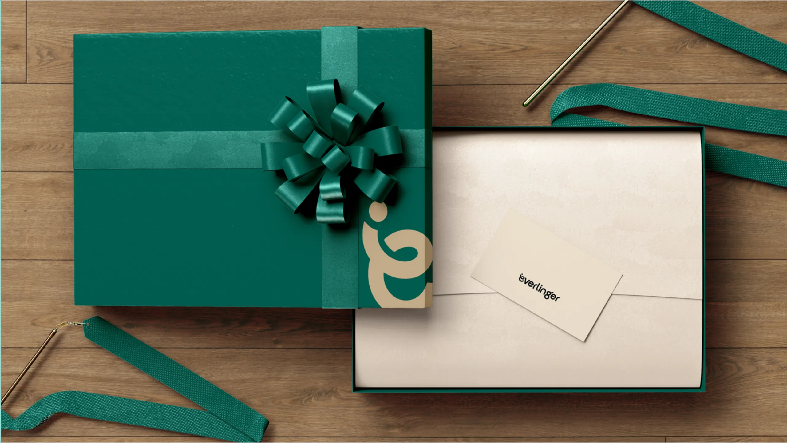
This does not mean being strange for its own sake. It means choosing a deliberate point of difference and committing to it. Everlinger earned its distinction through a specific tone and a tightly built system rather than louder graphics. The goal is to be recognized in a feed of competitors without the logo, which is the real test of whether an identity is doing structural work or just decorating.
Ask a simple question of any brand decision: would a customer remember this tomorrow? If the honest answer is no, you have built camouflage. In a category this noisy, camouflage is the most expensive choice you can make.
How fast can a startup actually build a real brand?
Faster than the year-long agency timeline suggests, if the process is built for speed. A startup brand does not need eighteen weeks of discovery. It needs decisive positioning, a complete identity system, and a site that ships. We run that as a seven-day sprint, and the constraint is a feature. A week forces the team to decide what the company actually stands for instead of deferring it through another round of moodboards.
The output is not a sketch. It is a working identity, a built site, and the launch assets to put it in market. We have run this across 5 AI and tech brands and more than 1,000 brands since 2018, and the pattern holds: front-loaded decisions and parallel execution produce sharper work than a slow process with the same inputs spread thin. The brands we ship this way average a 2.4x conversion uplift against what they replaced, because clarity converts and confusion does not.
Speed also matters strategically for an AI company specifically. The category moves monthly. A brand that takes two quarters to build can be positioned against a market that no longer exists by launch. Shipping fast keeps the brand aligned with where the company actually is.
What to do before you hire anyone
Get three things straight before a single pixel is designed: who the buyer is, what they are afraid of, and what changes when they choose you. Most failed startup brands fail at this layer, not the design layer. A beautiful identity built on fuzzy positioning is a beautiful version of fuzzy. The strategy has to be right first, and a good brand partner will refuse to start until it is.
Write your positioning as a sentence a customer would actually say back to you. If you cannot, the problem is upstream of design. Once that sentence is sharp, everything downstream gets faster and cheaper, because every visual and copy decision has a clear question to answer: does this make the sentence more true.
If you are building in AI or tech and the brand is lagging behind the product, that is the gap worth closing now, before the next raise or the next launch puts a spotlight on it. Our branding service is built for exactly this, and the seven-day sprint means you are not trading speed for depth. Tell us what you’re building and we will tell you, plainly, where the brand is costing you trust.
More from the blog

Beauty branding: how to build a cosmetics brand that sells on shelf and on social
Beauty branding is the system of identity, packaging, and story that makes a cosmetics brand recognizable and worth paying for. Here's how to build one.
Brand sprint vs traditional agency: which rebrand is right for you?
A 7-day brand sprint delivers the same core artefacts as an 8-12 week agency rebrand, at a fixed price. It removes waiting, not work. Here's the honest comparison.
Fashion branding: how to build a fashion or jewelry brand people want to wear
Fashion branding is the system of meaning, look, and language that makes a label desirable. Here is how to build one that converts, from positioning to launch.