
Beauty branding: how to build a cosmetics brand that sells on shelf and on social
Beauty branding is the system of identity, packaging, and story that makes a cosmetics brand recognizable and worth paying for. Here's how to build one.
Beauty branding is the system of name, logo, color, type, packaging, and story that makes a cosmetics product instantly recognizable and worth its price. You build a beauty brand by deciding what it stands for, designing a visual identity that survives a phone screen and a retail shelf at the same time, and applying that identity consistently across every surface a customer touches.
That is the short answer. The long answer is that most beauty founders get the order wrong. They commission a pretty logo before they have a position, then spend the next year wondering why the brand feels generic. Below is how we approach beauty branding across the cosmetics, skincare, and fragrance work we ship, and what actually separates a brand that holds from one that blurs into the category.
What is beauty branding, exactly?
Beauty branding is the deliberate design of how a cosmetics brand looks, sounds, and feels across every customer touchpoint. The logo is the part most founders fixate on, but it is one piece of a system that also has to carry the box, the bottle, the feed, and the shelf.
A complete beauty brand identity covers the wordmark and icon, a color palette, a type system, packaging rules, photography direction, and a voice. Each piece has to do two jobs at once. It has to read at thumbnail size in a feed, and it has to hold up under retail lighting next to forty competitors. A brand that only works in one of those contexts is half a brand. We design the full system because beauty buyers meet the product in both places, often within the same hour.
What does a beauty brand need to win on shelf and on social?
It needs a single recognizable asset that survives shrinking. Pick the one element — a mark, a color block, a bottle silhouette — that stays legible at 40 pixels and owns it everywhere.
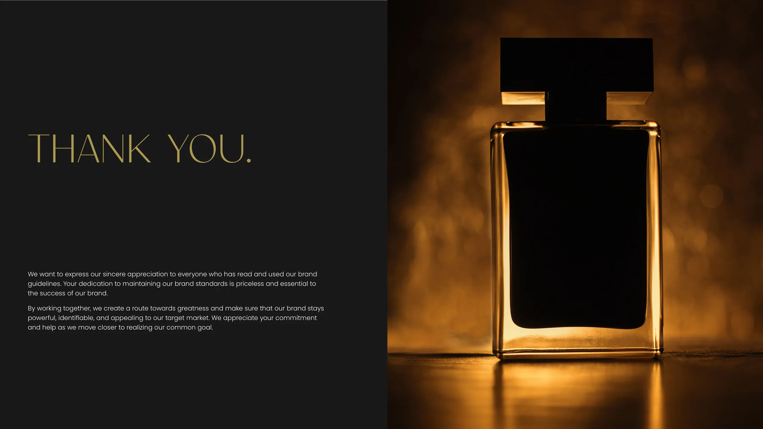
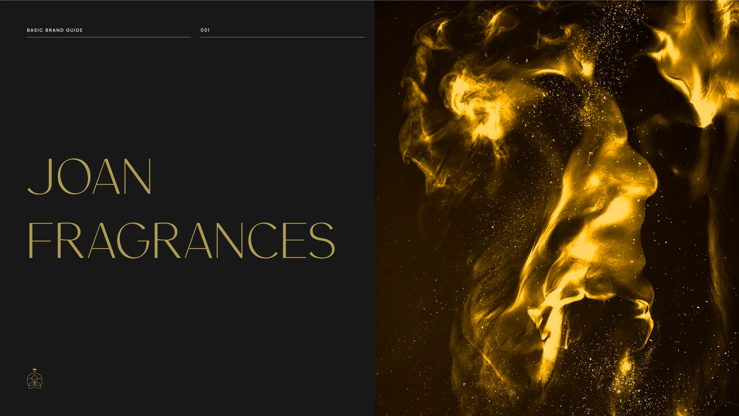
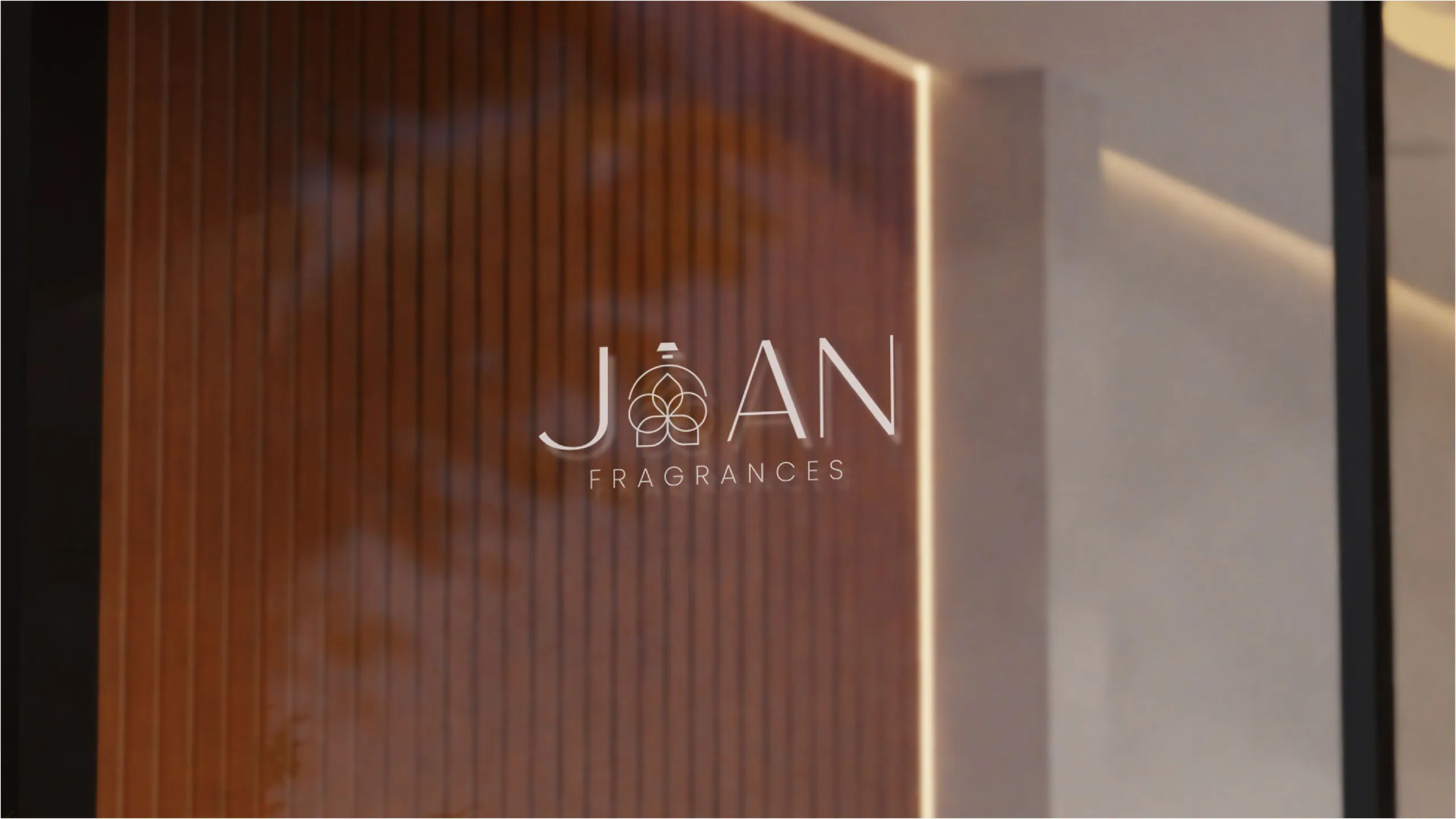
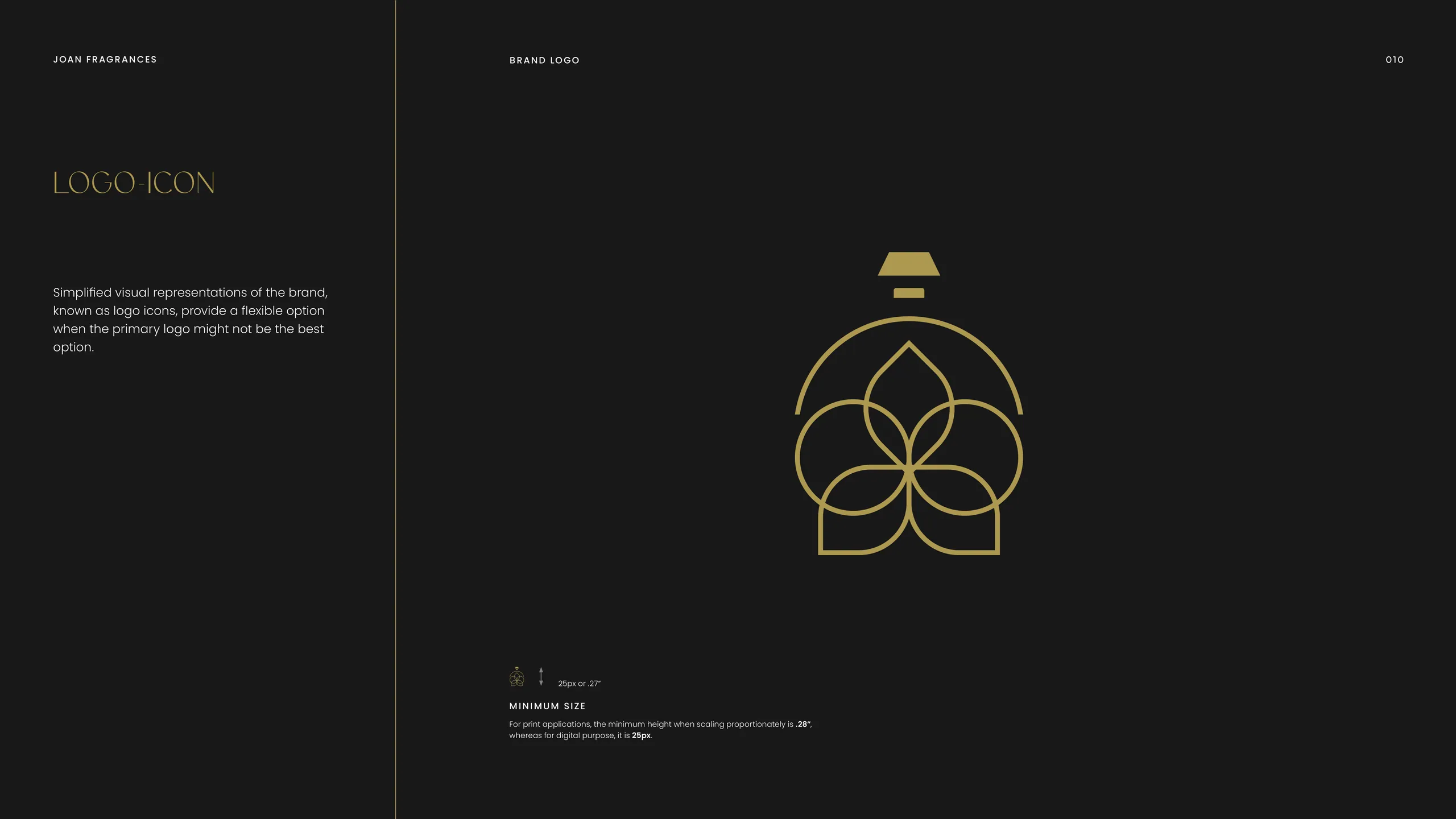
On shelf, you are competing with physical neighbors and bad lighting. On social, you are competing with motion, autoplay video, and a thumb moving at speed. The brands that win both have a distinctive asset that reduces cleanly. When we built the identity for Joan Fragrances, restraint was the strategy. A spare gold-on-dark system reads as luxury at full size and still holds its shape when it is one square in a grid of nine. The discipline is in what you leave out.
The test is simple. Shrink your packaging mockup to the size of a postage stamp and put it beside three competitors. If a stranger cannot point to yours in two seconds, the brand is not distinctive enough yet. Fix that before you spend on production.
How important is the ingredient or origin story?
For skincare and natural beauty it is often the entire purchase reason, so it belongs in the identity, not the footnotes. Customers in this category buy a belief about what is in the jar as much as the formula itself.
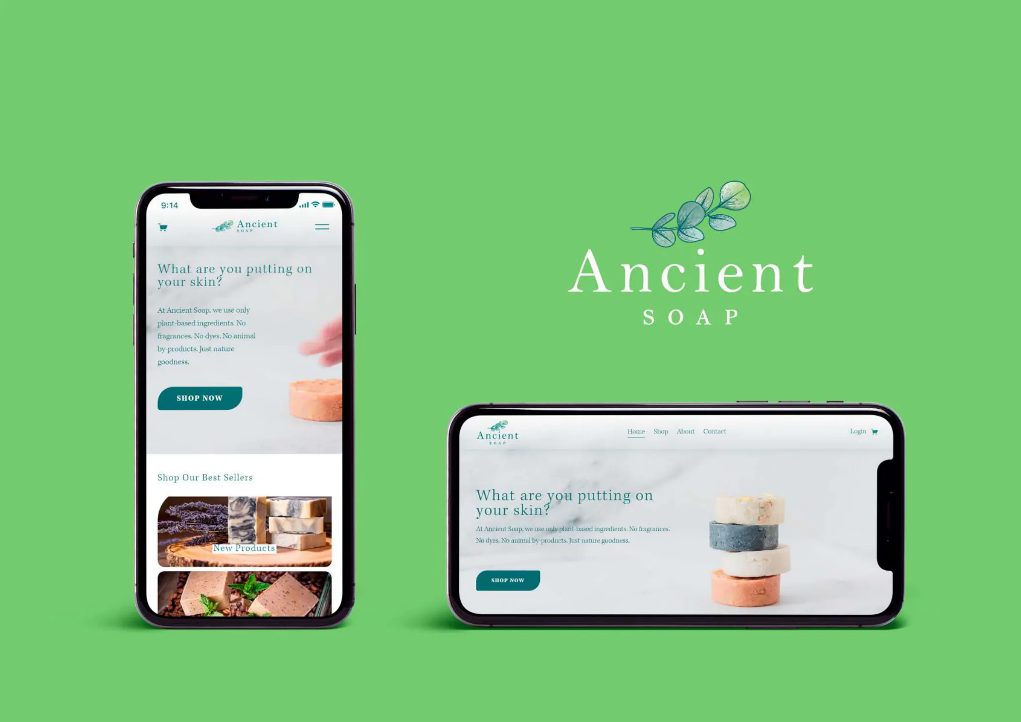
When the product leans on heritage, botanicals, or a specific origin, the brand system should carry that proof visibly. For Ancient Soap the whole identity was built around botanical heritage and a clean skincare ritual — a hand-drawn eucalyptus mark, a serif that signals craft, a forest-and-cream palette that does the storytelling before a single word is read. The design makes the claim before the copy explains it. That is the point. In beauty, the look is the first ingredient list a customer reads.
Be honest about the story, though. A fabricated origin gets caught fast in a category where customers research formulas and read every label. Build the identity on something true and the brand ages well.
How do you look premium on a startup budget?
Premium comes from restraint and consistency, not from spend. A tight palette, one excellent typeface, generous space, and ruthless consistency read as expensive. Clutter reads as cheap regardless of budget.
Most early beauty brands overspend on the wrong things and underinvest in the system that makes everything else look intentional. You do not need a fashion photographer in month one. You need a color and type system applied the same way on every surface, so the box, the site, the ad, and the unboxing video all feel like one brand. Consistency is what the eye reads as quality.
Three moves get a small brand most of the way to premium:
- Cut your palette to two or three colors and never break them.
- Choose one distinctive typeface for display and pair it with one clean workhorse for everything else.
- Give the design room. Empty space is the cheapest luxury signal there is.
Get those right and modest product photography still looks considered. Skip them and a five-figure photoshoot still looks like a template.
What does a complete beauty brand identity include?
A working beauty brand system covers identity, packaging, digital, and the rules that hold them together. The deliverable is not a logo file. It is a kit that anyone on the team can apply without guessing.
A complete system from our branding service typically includes:
- Logo system — primary mark, secondary mark, and the rules for each.
- Color and type tokens — defined values, not vibes, so production matches the design.
- Packaging direction — how the brand behaves on a box, a bottle, a label, a tube.
- Photography and art direction — lighting, composition, and styling rules.
- Digital application — how the identity translates to web, social, and ads.
- Voice — how the brand writes, in a category drowning in the same three adjectives.
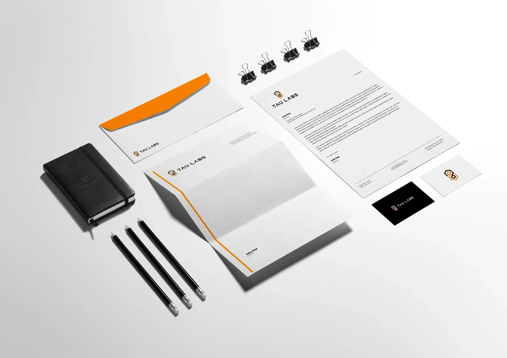
For Euphesia, the brief was specifically about extension: the same rules had to govern letterheads, business cards, signage, and web. The mark stays fixed, the surface changes, the brand still reads. That is what a real identity system buys you — coherence as you scale into surfaces you have not designed for yet.
How long should a cosmetics rebrand take?
Less time than you think, if the process is built for it. A full beauty brand identity does not require a six-month agency engagement. We run ours as a seven-day sprint.
The slow part of branding has never been the design. It is the waiting — the moodboard rounds, the stakeholder loops, the staging links that sit untouched for a week. Compress the decisions and the work itself moves fast. In seven days a cosmetics brand can go from positioning to a complete identity system and a live site, with packaging direction and social templates included. Speed also keeps the vision intact. A brand designed in a focused week holds together better than one assembled over a fragmented quarter where the positioning drifts between meetings.
We have built 11 beauty brands inside that model, part of 1,000+ brands shipped since 2018. The category specifics — the shelf test, the ingredient story, the surface extension — are baked into the process so nothing gets discovered late.
What about brands that combine beauty with another category?
Treat the beauty side with full category discipline even when it is one line in a broader business. Wellness, lifestyle, and supplement brands often carry beauty SKUs, and those SKUs still have to pass the shelf-and-social test.
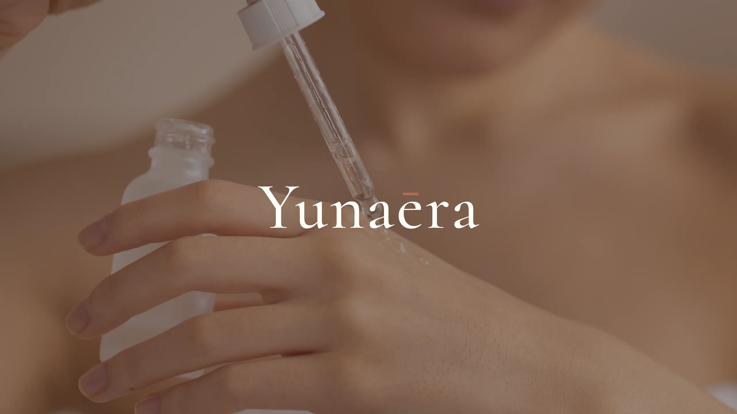
A skincare line inside a wellness brand cannot coast on the parent identity. It needs the same packaging rigor and the same distinctive asset as a standalone beauty brand, or it underperforms next to focused competitors. Work like Yunaera sits in this space, where the beauty-adjacent identity has to feel as considered as a pure-play cosmetics brand. The lesson holds across the portfolio: a beauty product is judged against beauty brands, not against whatever larger thing it belongs to.
How do you know the branding is actually working?
It shows up in conversion, not in compliments. A beauty brand is working when more of the people who see it buy, when it photographs well in user content, and when customers describe it back to you the way you intended.
Aesthetics that do not move numbers are decoration. The identities we ship are built to convert, and across our work the average conversion uplift after a beauty branding rebuild runs about 2.4x. That comes from the same fundamentals all the way through — a distinctive asset, a consistent system, an honest story, and packaging that survives the postage-stamp test. None of it is mysterious. It is just done completely, which most brands never get around to.
If you are building or rebuilding a beauty brand and you want the full system rather than another logo, start a conversation. Tell us what is in the jar and who it is for, and we will walk you through what the brand needs to win on shelf and in a feed.
More from the blog
Brand sprint vs traditional agency: which rebrand is right for you?
A 7-day brand sprint delivers the same core artefacts as an 8-12 week agency rebrand, at a fixed price. It removes waiting, not work. Here's the honest comparison.

Branding for AI and tech startups: how to look as credible as your technology
Brand an AI or tech startup by making the technology legible, the category clear, and the proof obvious. Here's the playbook we use on every build.
Fashion branding: how to build a fashion or jewelry brand people want to wear
Fashion branding is the system of meaning, look, and language that makes a label desirable. Here is how to build one that converts, from positioning to launch.