
Healthcare branding: how to brand a medical practice patients actually trust
Healthcare branding is the system of identity, language, and design that makes a medical practice feel safe and credible before the first appointment.
Healthcare branding is the system of visual identity, language, and design choices that signals competence and care to a patient before they ever meet a clinician. Done well, it lowers the perceived risk of choosing your practice, which is the real decision a patient is making when they pick a provider.
That risk calculation is what separates healthcare branding from branding in most other categories. A patient choosing a dermatologist or a surgeon is not buying a product they can return. They are handing their body, and often their family’s, to a stranger. Every element of your brand either reduces that anxiety or quietly raises it.
What is healthcare branding, exactly?
Healthcare branding is everything a patient sees and reads that shapes their judgment of clinical quality before any clinical interaction happens. It is the logo on the building, the tone of the booking confirmation, the photography on the homepage, and the way the front desk answers the phone.
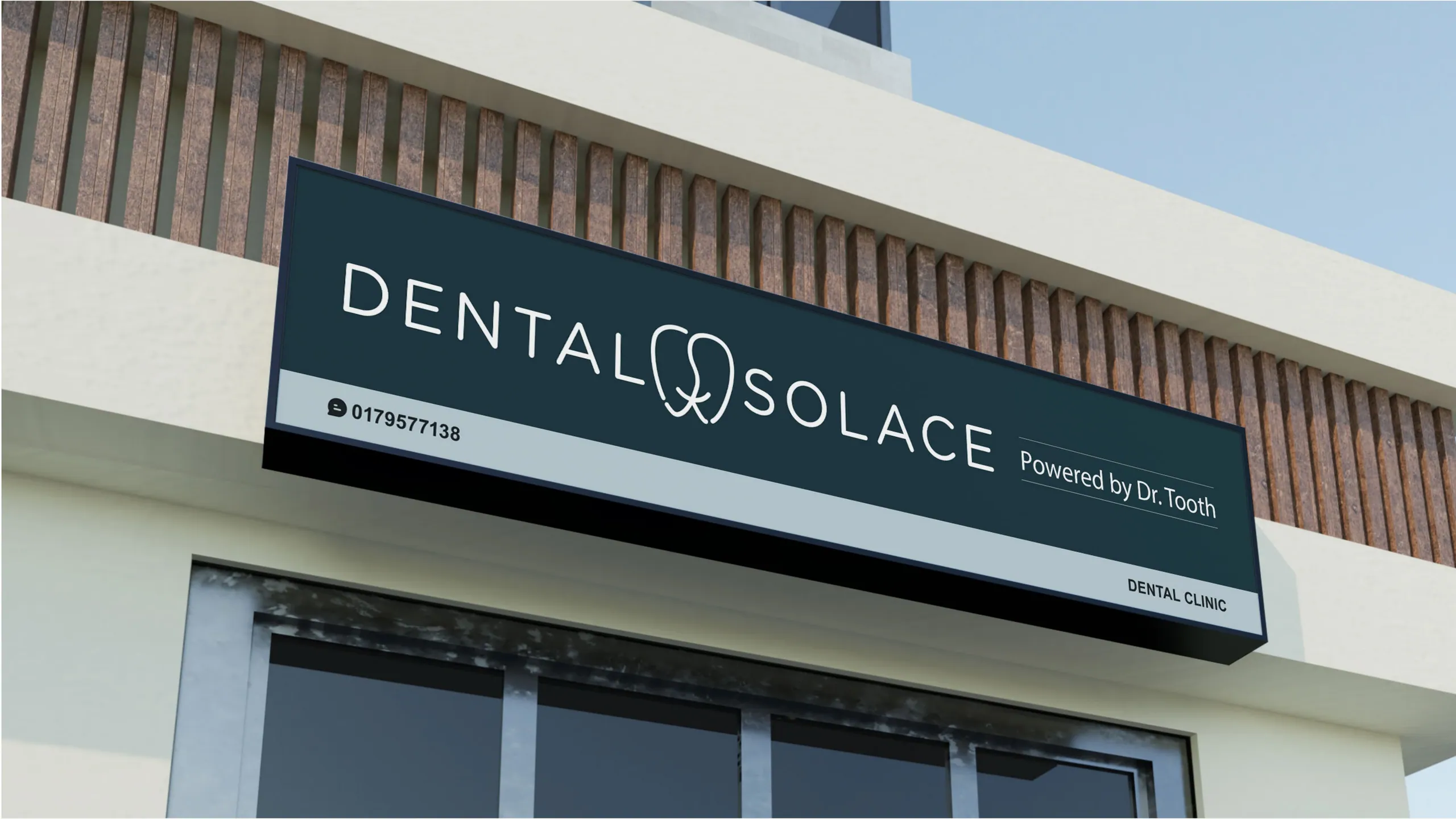
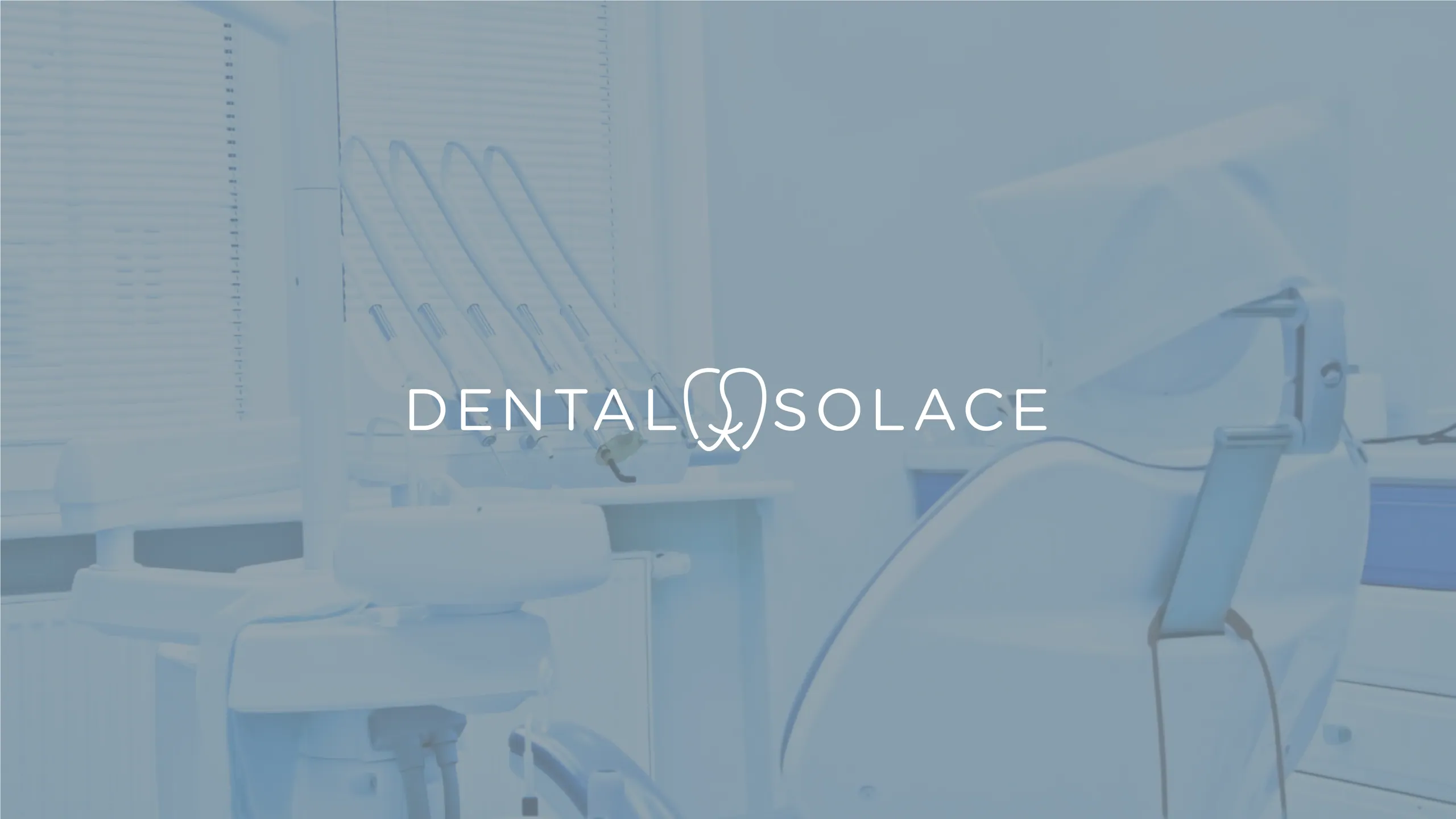
People assume they judge a practice on outcomes. They mostly can’t. A patient has no way to assess a surgeon’s technique or a clinic’s infection rates from the outside. So they substitute proxies: does this place look organized, does it sound calm, does it feel like somewhere competent people work. Your brand supplies those proxies. When we built the identity for Dental Solace, the brief was a teal and warm sand palette specifically chosen to read as clinical trust without the cold, institutional feeling that makes people delay care.
What makes medical branding different from other branding?
Medical branding carries a trust burden no other category does, and it operates under regulatory constraints that limit the usual marketing playbook. You cannot overpromise outcomes, you often cannot show before-and-after work without consent and disclaimers, and patient privacy rules govern what you can publish.
Three differences matter most in practice:
- Emotional stakes are higher. A patient arriving at a plastic surgery consultation or a diagnostic clinic is anxious by default. The brand’s job is to settle the nervous system, not to excite it. That changes color choices, typography weight, and image direction.
- Credibility has to be visible, not claimed. Saying “trusted” does nothing. Showing accreditation marks, clean information design, and consistent application across every touchpoint does the work instead.
- Restraint reads as competence. In consumer brands, energy and novelty often win. In healthcare, a quiet, controlled identity signals a practice that has its operations in order. For Insyght Health we built around a deep forest green and a precise concentric-circle mark that references diagnostic focus, because the brand needed to feel like it knew exactly what it was doing.


How do you build patient trust through branding?
You build trust by being consistent and specific across every place a patient touches the practice, because inconsistency reads as carelessness and carelessness reads as clinical risk. Trust is not one bold gesture. It is the absence of small mismatches.
Patients notice when the website looks premium but the intake form is a blurry PDF. They notice when the waiting room is calm but the appointment reminder text sounds robotic. Each gap forces them to wonder which version is real. A coherent brand removes that doubt by making every interaction feel like it came from the same careful hand.
The mechanics of building this are unglamorous and they work:
- Define one positioning idea and hold it everywhere. Honey Health is “clinical confidence with warmth.” That single idea decided the navy and mint palette, the type pairing, and the way the Honey Health collateral was rendered across stationery and patient-facing print.
- Standardize the language. Write the booking flow, the reminders, and the post-visit follow-up in one consistent voice. Patients read more of your words than they see of your logo.
- Show, then state. Lead with proof a patient can evaluate, accreditation, real photography, clear pricing where regulation allows, and let claims follow the evidence rather than replace it.

Why does a medical practice need a strong brand at all?
Because in most local markets the clinical offering is close to identical, and the brand is the only thing a patient can compare before they commit. Two cardiologists may be equally skilled. The patient cannot see that. They choose the one whose practice feels more in control.
A strong brand also does work after the visit. It makes referrals easier to give, because a patient recommending you needs a name and a feeling they can pass along. It supports premium pricing, because a practice that looks considered can justify charging like one. And it protects you when something goes wrong, since a brand that has banked trust gets more benefit of the doubt than one that hasn’t. This is the commercial case for treating healthcare branding as infrastructure rather than decoration.
Can a clinic rebrand without breaking compliance?
Yes, as long as the rebrand treats regulatory and privacy requirements as design constraints from day one rather than a legal review bolted on at the end. Most compliance failures in rebrands come from claims and imagery, not from logos or color.
The areas to handle carefully:
- Outcome claims. Anything implying guaranteed results, comparative superiority, or unsubstantiated statistics needs to go through your regulatory standard before it ships. Build the copy with that filter on.
- Patient imagery and testimonials. Consent, disclaimers, and the rules of your jurisdiction govern what you can show. Plan for properly released photography or art-directed brand imagery instead of borrowing patient material.
- Accreditation and licensing marks. These have usage rules. Get them right and they become some of your strongest trust signals.
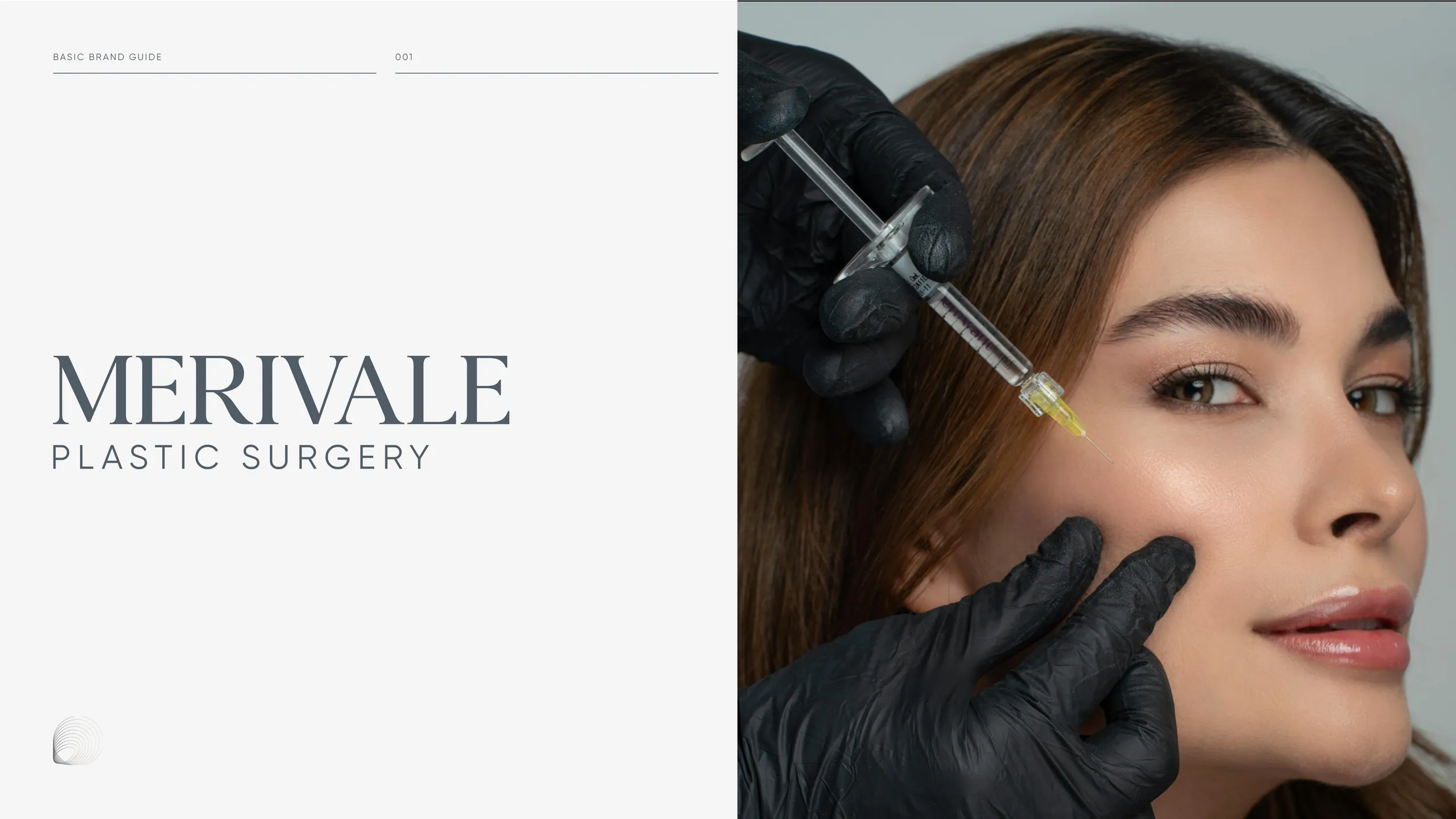
For a practice like Merivale Plastic Surgery, the cool slate and warm neutral palette had to hold weight across both clinical and luxury touchpoints, which meant the system was designed to flex without ever drifting into claims it couldn’t support. A good rebrand makes compliance easier, not harder, because a clear system gives everyone a single approved way to present the practice.
What does a healthcare rebrand actually involve?
A complete healthcare rebrand covers positioning, visual identity, patient-facing language, and the digital experience, delivered as one connected system rather than separate projects. A new logo on an old website and a clunky booking flow is not a rebrand. It is a fresh coat of paint on a leaking roof.
The work breaks into four layers, and they have to agree with each other:
- Strategy. Who the practice is for, what it stands for, and how it differs from the clinic down the road.
- Identity. The logo system, palette, typography, and image direction that carry that strategy visually.
- Language. The voice across the site, intake, reminders, and follow-up.
- Experience. The website and booking flow where most patients actually decide.
Our branding service builds these as a single dependent system inside one seven-day sprint, so the palette chosen on strategy day is the same palette running on the live site at the end of the week. Nothing gets lost in handoff between a strategist, a designer, and a developer who never spoke.
How long should branding a medical practice take?
It should take days, not months, because a rebrand that drags across a quarter loses the clarity it started with and costs the practice momentum it can’t get back. Long timelines do not produce better healthcare brands. They produce committees.
We run healthcare brands through a seven-day sprint. Strategy and positioning land first, the visual identity follows, the site gets built, and the practice ships a coherent brand by the end of the week. We have done this for 10 healthcare brands, inside a track record of more than 1,000 brands built since 2018, with a 2.4x average conversion uplift across the work. The compressed timeline is not a shortcut on quality. It is a forcing function that keeps the brand sharp and gets the practice in front of patients sooner.
Where most healthcare brands go wrong
The common failure is hiding. Practices choose the safest possible identity, a blue logo, a stock photo of a smiling clinician, a name that could belong to anyone, and end up indistinguishable from every competitor. Safe is not the same as trustworthy. A patient cannot trust a brand they cannot tell apart from four others.
The second failure is treating the brand as a launch event instead of a system. The logo gets approved, everyone moves on, and within a year the website, the forms, and the signage have all drifted in different directions. Trust leaks out through those gaps.
If you are weighing a rebrand for your practice, the question worth asking is whether your current brand makes a nervous patient feel safer or just looks acceptable. If you want a brand that does the first, start a conversation with us. Tell us what the practice does and who you treat, and we will be straight about whether a rebrand moves the needle for you right now.
More from the blog

Beauty branding: how to build a cosmetics brand that sells on shelf and on social
Beauty branding is the system of identity, packaging, and story that makes a cosmetics brand recognizable and worth paying for. Here's how to build one.

Brand sprint vs traditional agency: which rebrand is right for you?
A 7-day brand sprint delivers the same core artefacts as an 8-12 week agency rebrand, at a fixed price. It removes waiting, not work. Here's the honest comparison.

Branding for AI and tech startups: how to look as credible as your technology
Brand an AI or tech startup by making the technology legible, the category clear, and the proof obvious. Here's the playbook we use on every build.