
Food and beverage packaging design: how CPG brands win on the shelf
Good food and beverage packaging design reads in one second, survives a phone photo, and scales from a single SKU to a full retail line.
Good food and beverage packaging design does three jobs at once: it identifies the product in under a second, it tells the buyer what’s inside and why it’s different, and it holds up across every size and surface the brand will ever print on. Everything else is decoration. If the pack fails any of those three jobs at arm’s length on a crowded shelf, the recipe inside doesn’t get a chance to matter.
We’ve built food & beverage branding for 13 food and drink brands, part of 1,000+ brands shipped since 2018. This is how we think about packaging when the goal is sell-through, not a design award.
What makes good food and beverage packaging design?
A pack works when a shopper can name the product, the flavor, and the reason to buy it from three feet away. That’s the test. Not how it looks zoomed in on a laptop, but how it reads at shelf distance, under fluorescent light, next to ten competitors fighting for the same glance.
Most CPG packaging fails because it was designed at 100% on a monitor and never checked at thumbnail scale. The brand name is legible. The flavor descriptor is a whisper. The hierarchy collapses the moment the pack is six inches tall and surrounded by noise. Strong packaging design fixes the order of operations: brand, then product, then flavor, then proof, then the small print nobody reads until they’re already holding it.
What does packaging need to do on a shelf?
On a shelf, packaging has one job before any other: get noticed, then get understood. Attention first, comprehension second, persuasion third. Skip the order and the design stalls.
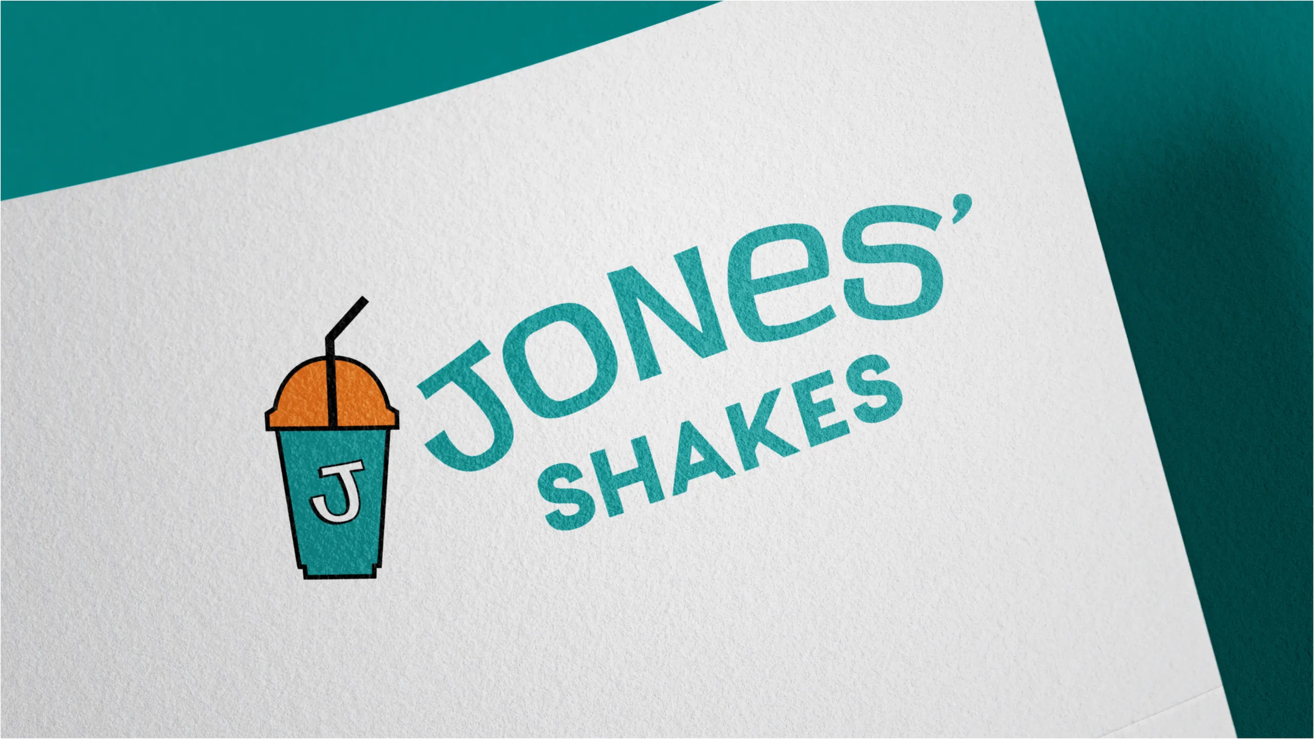
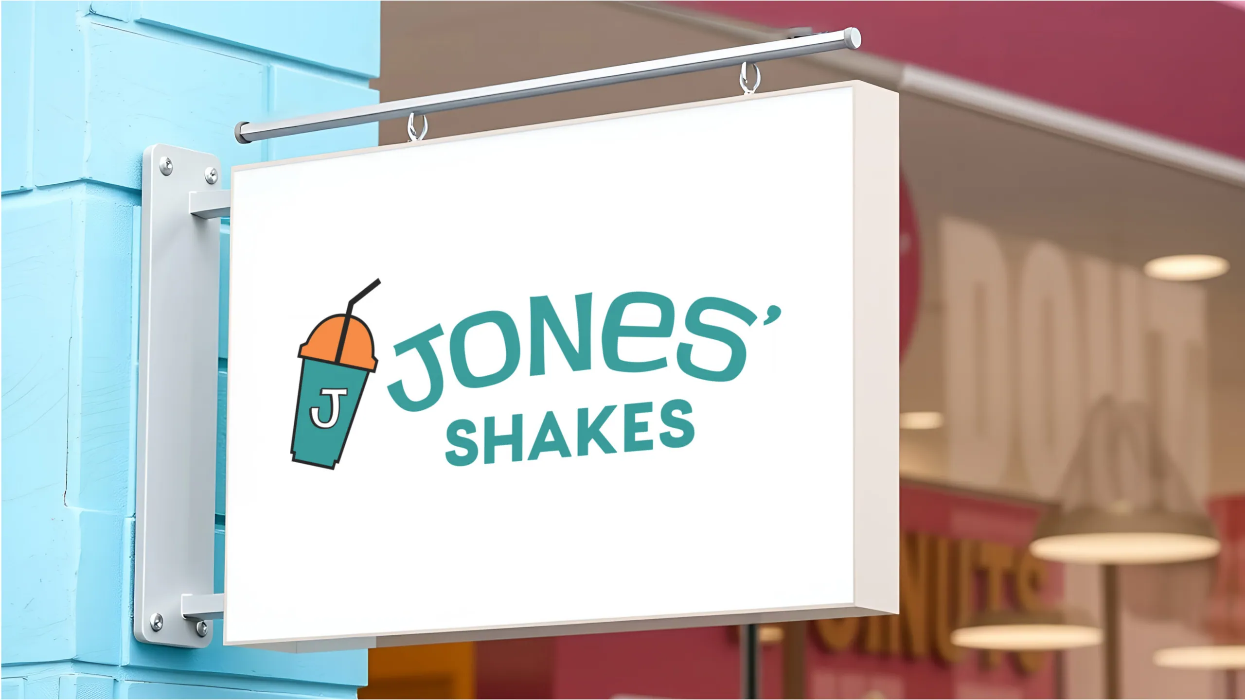
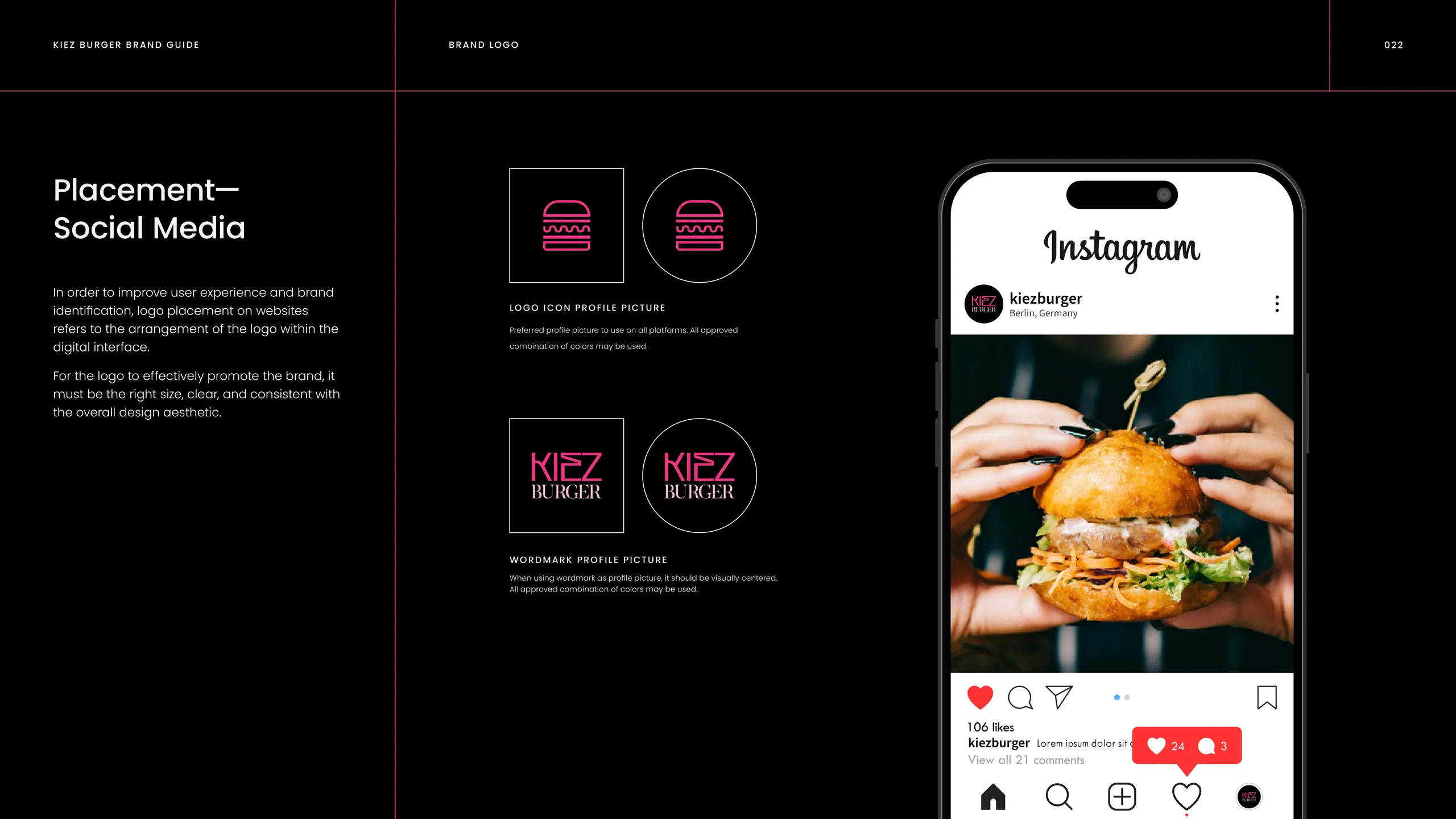
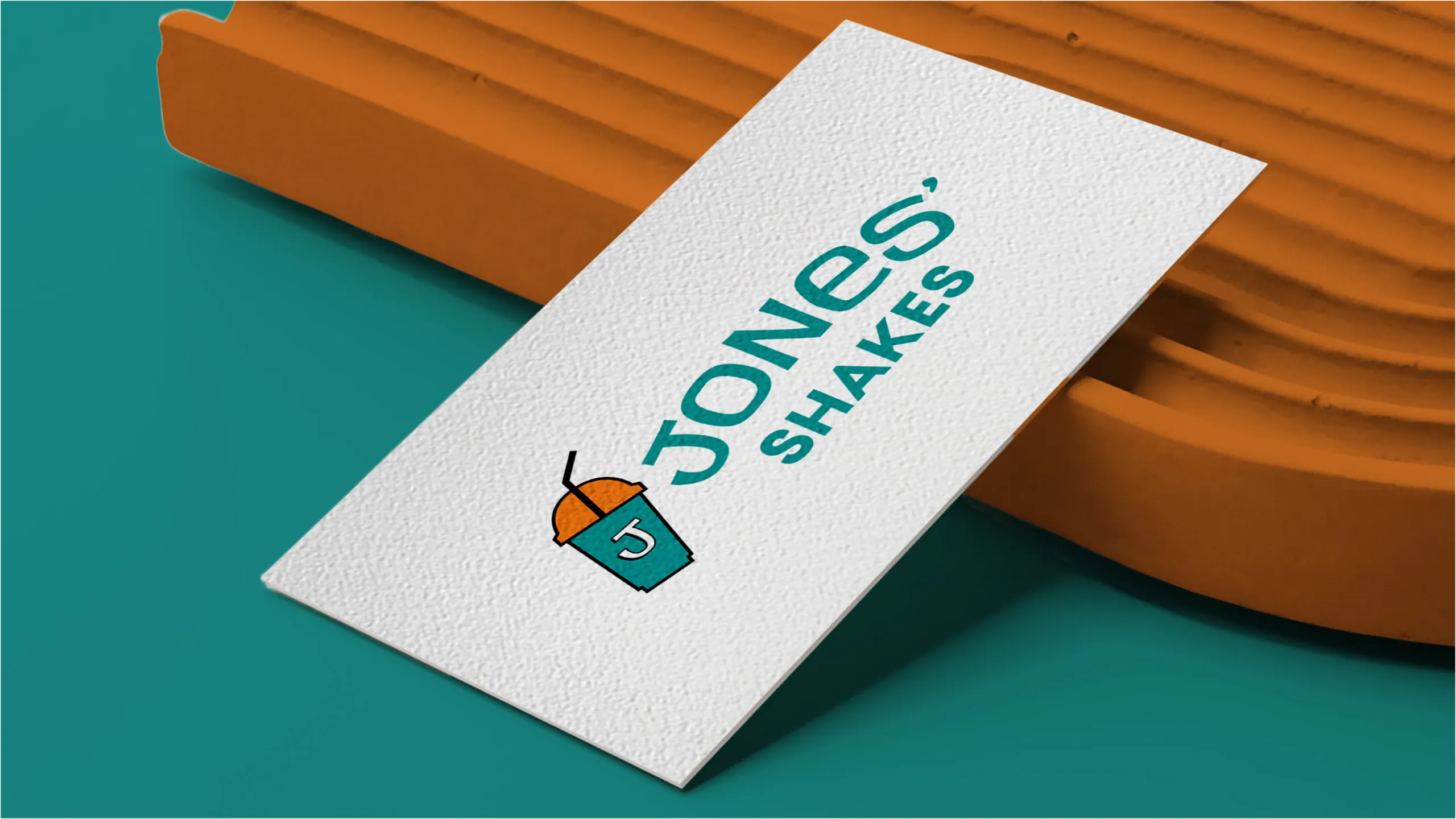
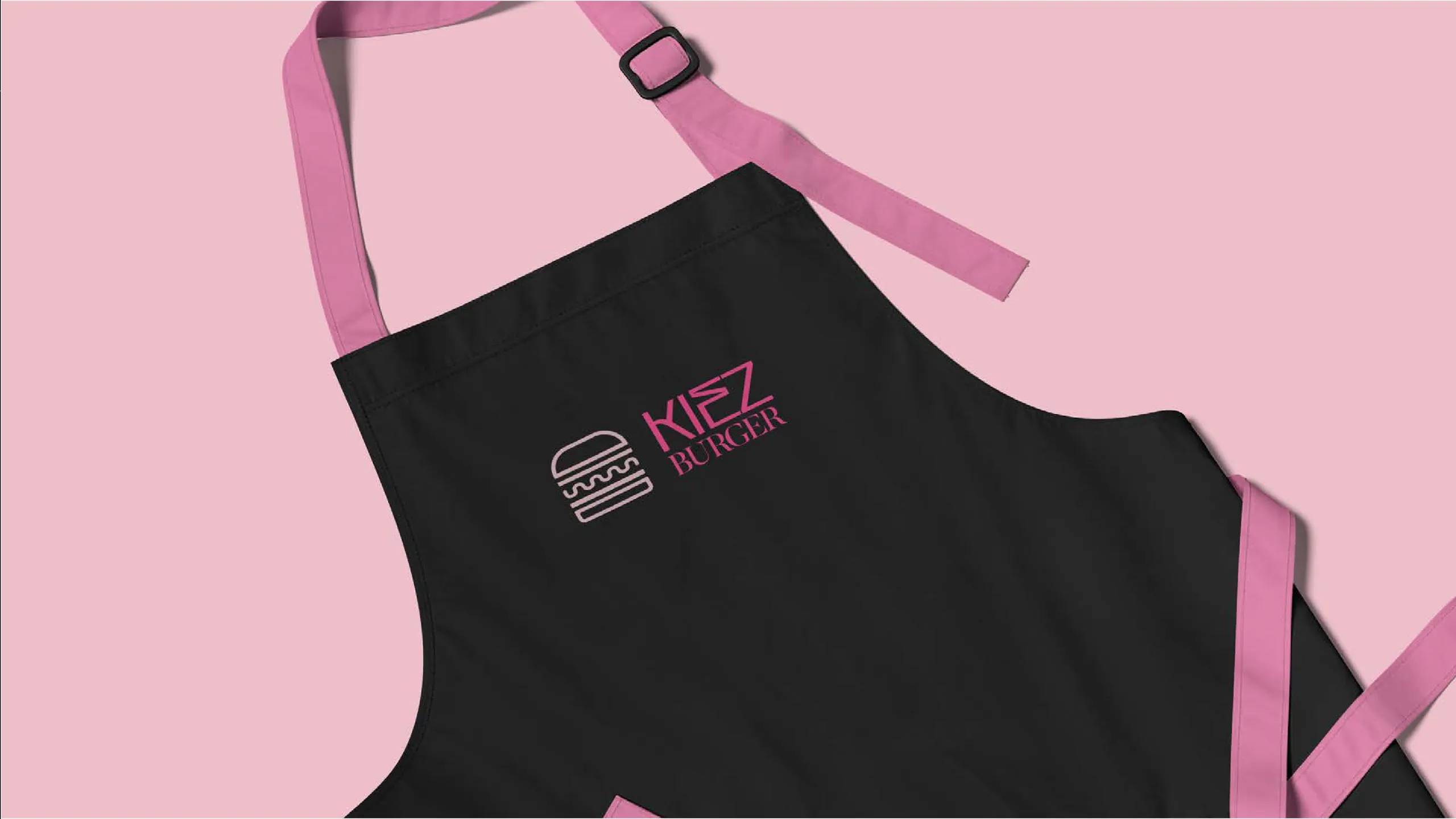
Getting noticed is usually a color and shape problem. Kiez Burger owns hot pink against black, which reads as a single block of brand from across a room. Jones Shakes runs a high-energy teal, orange, and red system with a custom illustrated cup, so the pack is recognizable before a single word is read. That recognition is the asset. Once the eye lands, the buyer needs to understand the product in the next half-second. What is it, what flavor, what makes it worth the reach. If your packaging spends its attention budget on a beautiful pattern and then hides the flavor name in 8pt type, you bought attention and wasted it.
The third job, persuasion, is where claims, certifications, and proof points live. They matter, but they’re the last thing the buyer processes, not the first. Designers who lead with a wall of badges bury the parts that actually trigger the purchase.
How do you design a food brand that scales to retail?
You design the system, not the single pack. A food brand that scales is one where the identity survives the jump from one hero SKU to a twelve-product line, from a 250ml can to a wrap to an exterior sign, without losing its signature.
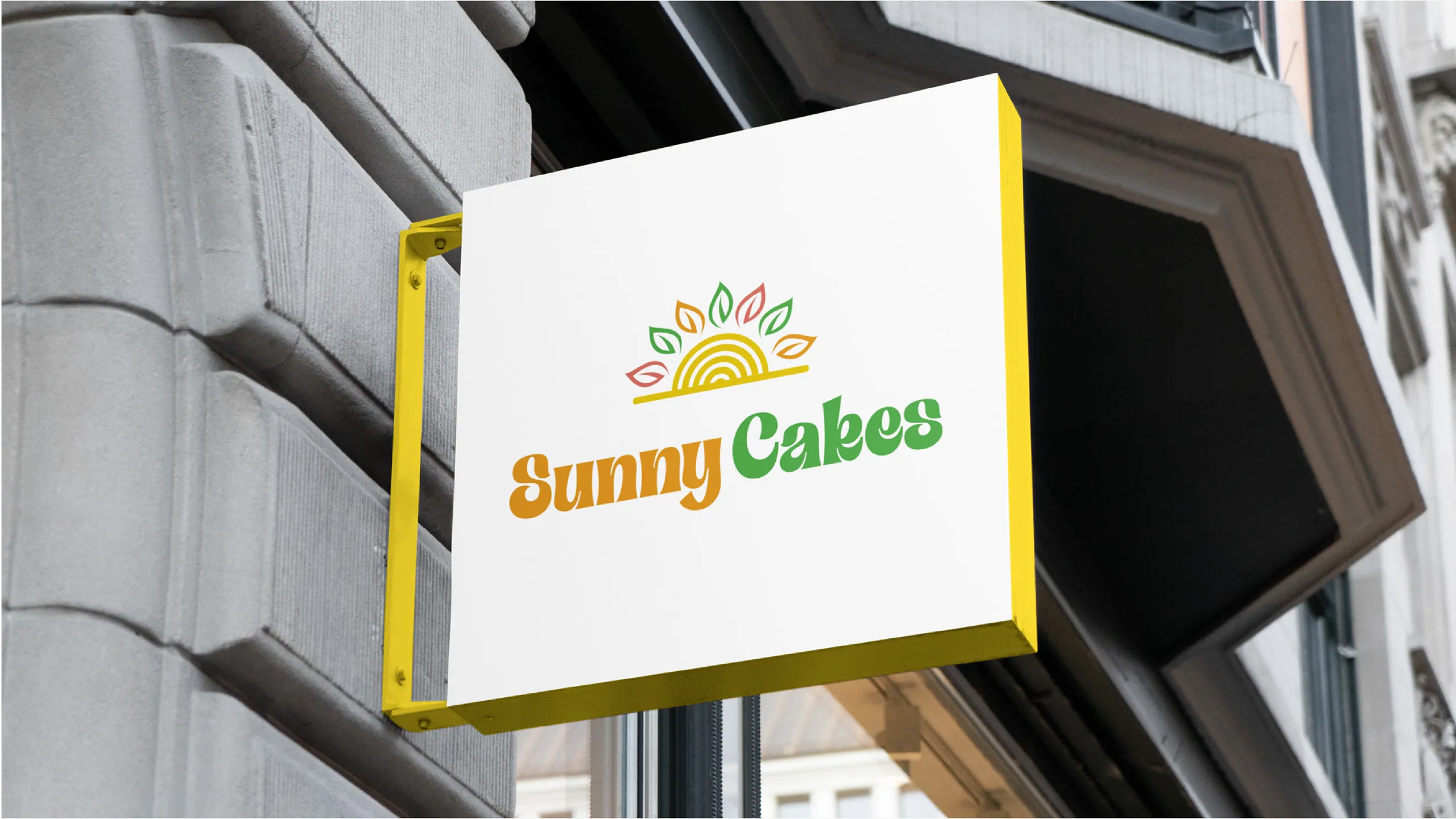
This is the most common failure we’re hired to fix. A founder nails the look of their first product, then launches three more flavors and the line looks like four different companies. The fix is a packaging system: a fixed logo lockup, a flavor-color logic that’s decided once and applied everywhere, a typographic hierarchy that holds at every size, and a repeating motif that does the recognition work. Kiez Burger’s pattern travels from burger-wrap paper to signage to social with no redrawing. Son Estate Coffee carries a single estate identity across bag sizes and roast variants so the range reads as one family. Sunny Cakes holds a consistent voice from box to label to storefront.
The system is also what makes new SKUs cheap. When the rules are set, launching a fourth flavor is a color swap and a name change, not a fresh design project. That’s the difference between a brand that can move at retail speed and one that pays for a redesign every time it grows.
/page-026.webp)
Packaging versus branding: where’s the line?
Branding is the strategy and identity; packaging is where that identity meets the buyer’s hand. The pack is the most-used, highest-stakes application of the brand, and it’s where abstract positioning becomes a concrete buying decision.
You can’t design good packaging without the brand decisions underneath it. Who is this for, what does it stand against, what feeling should it trigger, what’s the one thing it wants to be known for. Get those wrong and the packaging is a well-executed answer to the wrong question. That’s why our branding work treats packaging as the proving ground for the identity, not a separate deliverable bolted on afterward. The logo, color, type, and voice all get pressure-tested against the hardest application first: a small physical surface, viewed for one second, by someone who has never heard of you.
What separates premium CPG packaging from generic?
Premium packaging looks considered at every level the eye travels: silhouette, color, type, and the smallest detail you only notice when you’re holding it. Generic packaging looks fine at one distance and falls apart at the others.
The tells are specific. Premium packs commit to a restrained palette and own it instead of using six colors to seem energetic. They set type with real hierarchy and intentional spacing, not stock fonts at default tracking. They earn one or two custom assets, an illustrated mark or a proprietary pattern, that no competitor can copy. And they sweat the close-range details, the unboxing, the inside of the lid, the texture, because that’s where a buyer decides whether to repurchase. Generic packaging treats the pack as a label-printing exercise. Premium packaging treats it as the product’s first and most repeated impression.
None of this requires a bigger budget than a generic pack. It requires deciding what the brand is before designing the surface, then having the discipline to leave things out.
How much does CPG branding cost?
A full food and beverage brand and packaging system runs as a fixed-scope 7-day sprint, not an open-ended retainer. You get the strategy, identity, and packaging system in a week, for a known price, instead of a three-month agency engagement with a moving total.
The honest answer to cost is that it depends on scope, but the model matters more than the number. Traditional CPG branding stretches across months of rounds, and the bill grows with the timeline. We compress the work into a 7-day sprint with a fixed deliverable: positioning, identity, and a packaging system ready to send to print. That structure is why the price is predictable. The brand is in-market earlier, which is the part that actually pays for the work. Across our brand builds, the assets we ship drive a 2.4x average conversion uplift once they’re live, because a pack that reads in one second converts a glance into a pickup more often than one that doesn’t.
What you’re buying is the system and the decisions, not a stack of files. The files are the easy part. The hard part is the order of operations that makes the pack work on the shelf, and that’s what the sprint is built to deliver.
What should you have before designing packaging?
Before any pack gets designed, you need positioning, a flavor or product architecture, and a clear hierarchy of what the buyer must see first. Skip those and you’re decorating a guess.
Positioning tells the designer what to amplify and what to cut. Product architecture, how many SKUs now and where the line is headed, decides whether you’re designing one pack or a system. And the hierarchy, the ranked list of what the buyer needs to read in order, is the brief that keeps the design honest. We pull these out of a single founder session at the start of every sprint, because guessing at them mid-design is what produces the four-flavors-four-companies problem later. The brands that scale cleanly are the ones that did this thinking before the first pixel, not after the first reprint.
Ready to build a pack that sells?
If you’re launching a food or drink brand, or your current line looks like four companies pretending to be one, the fix is a packaging system designed against the shelf, not the monitor. We’ve done it for food & beverage branding clients across shakes, burgers, coffee, and baked goods, and we do it in a week.
Tell us about your product and we’ll show you what a 7-day brand and packaging sprint would deliver for it.
More from the blog
Beauty branding: how to build a cosmetics brand that sells on shelf and on social
Beauty branding is the system of identity, packaging, and story that makes a cosmetics brand recognizable and worth paying for. Here's how to build one.
Brand sprint vs traditional agency: which rebrand is right for you?
A 7-day brand sprint delivers the same core artefacts as an 8-12 week agency rebrand, at a fixed price. It removes waiting, not work. Here's the honest comparison.

Branding for AI and tech startups: how to look as credible as your technology
Brand an AI or tech startup by making the technology legible, the category clear, and the proof obvious. Here's the playbook we use on every build.