
How to brand a cannabis company without looking like every other cannabis brand
To brand a cannabis company, fix positioning first, then build a compliant identity and packaging system that survives regulators and stands out on the shelf.
To brand a cannabis company, start with positioning, not the logo: decide who you serve, what you stand for, and why a customer should pick you off a crowded shelf. Then build an identity and packaging system that holds up under the category’s compliance rules and still reads as a real brand rather than another green leaf and a generic serif. Most cannabis brands skip the first half and over-invest in the second, which is why the category looks so uniform.
We’ve branded 7 cannabis brands inside this process, part of 1,000+ brands since 2018. The pattern is consistent. The brands that win are the ones that made hard positioning choices early, then let those choices govern every label, font, and colour downstream. Here’s how that actually works.
How do you brand a cannabis company that doesn’t blend in?
Differentiation comes from positioning, not decoration. Pick a clear audience and a clear stance, then let the visual system express that one idea rather than copying category conventions.
Cannabis has strong visual gravity. Walk into any dispensary and the shelves rhyme: leaf marks, weed puns, the same handful of greens, type that signals “stoner” or “wellness” with no middle ground. When everyone borrows the same cues, nobody stands out, and the customer defaults to price.
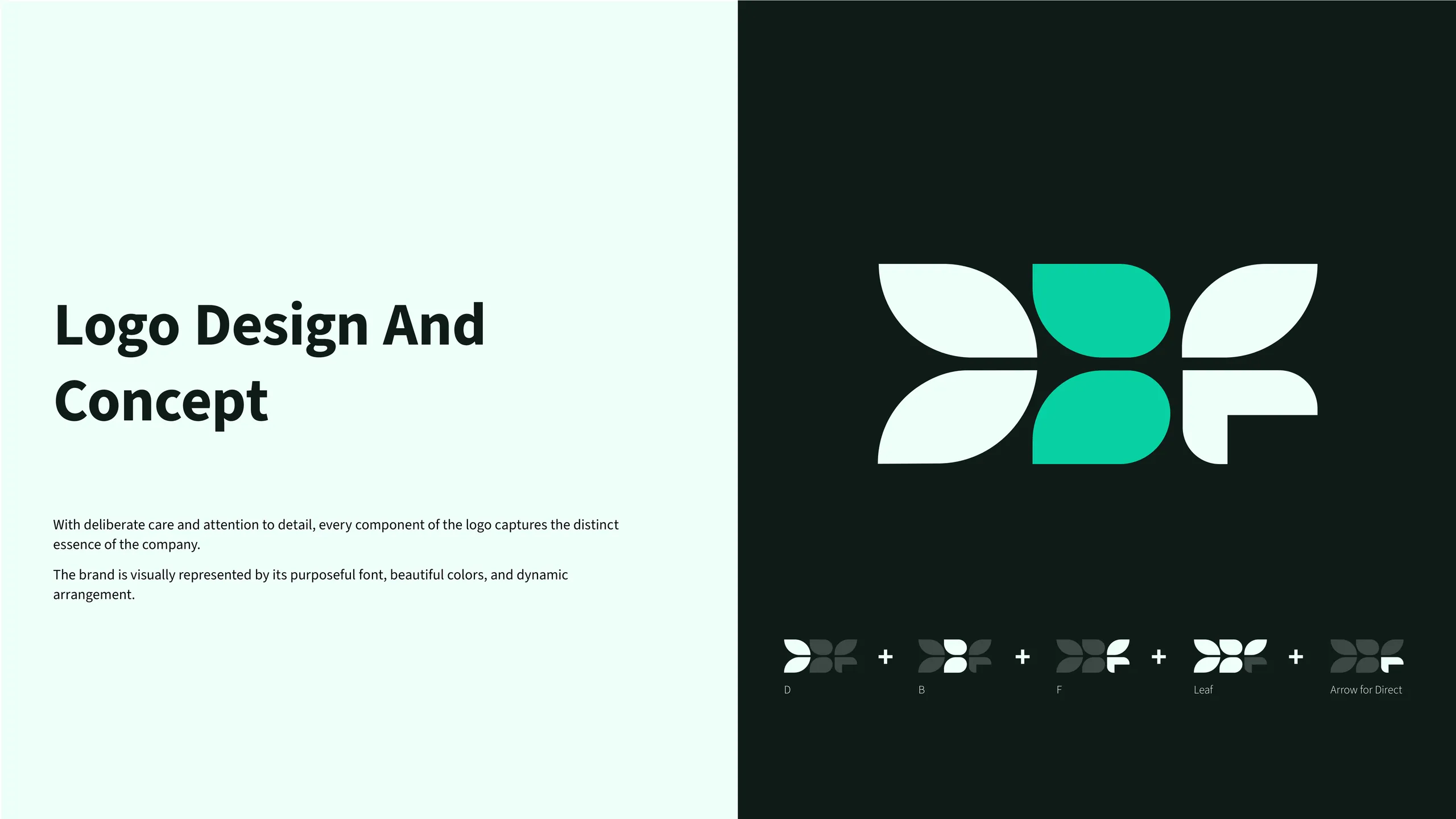
The way out is to decide what the brand is before you draw anything. When we built CraftCanna, the whole identity hung on one intentional mark. Every component was chosen to convey the character of that specific business, and a brand guide locked it in place so the system stayed coherent across applications. The result reads as a deliberate brand, not another cannabis logo. That only happens when positioning leads and design follows.
How do you keep cannabis branding compliant?
Treat regulation as a design constraint you build for from the start, not a legal review you bolt on at the end. The rules differ by jurisdiction, so the system has to be designed to flex.
Cannabis sits under advertising, packaging, and labelling rules that change between states, provinces, and countries. Common constraints include mandatory warning panels, THC and CBD content disclosure, child-resistant packaging, restrictions on imagery that appeals to minors, and limits on health claims. None of this is optional, and a beautiful label that fails a compliance check is worthless.
The practical move is to design the compliant version first. Reserve the legally required panels, type sizes, and warnings as fixed zones, then design the brand to live around them. A system built this way survives a move into a new market because the structure already assumes the rules will shift. A system designed purely for aesthetics gets torn apart the first time legal touches it. Compliance handled early is invisible; handled late, it’s a redesign.
What does cannabis packaging actually need?
Packaging has to do three jobs at once: pass compliance, survive the physical format, and convert a shopper in the few seconds they spend at the shelf. Most brands solve one and ignore the other two.
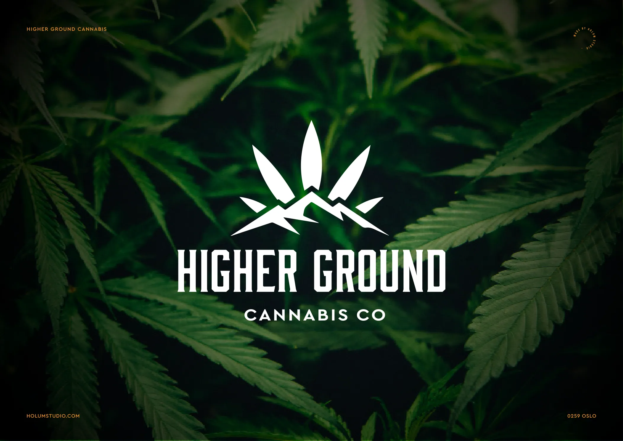
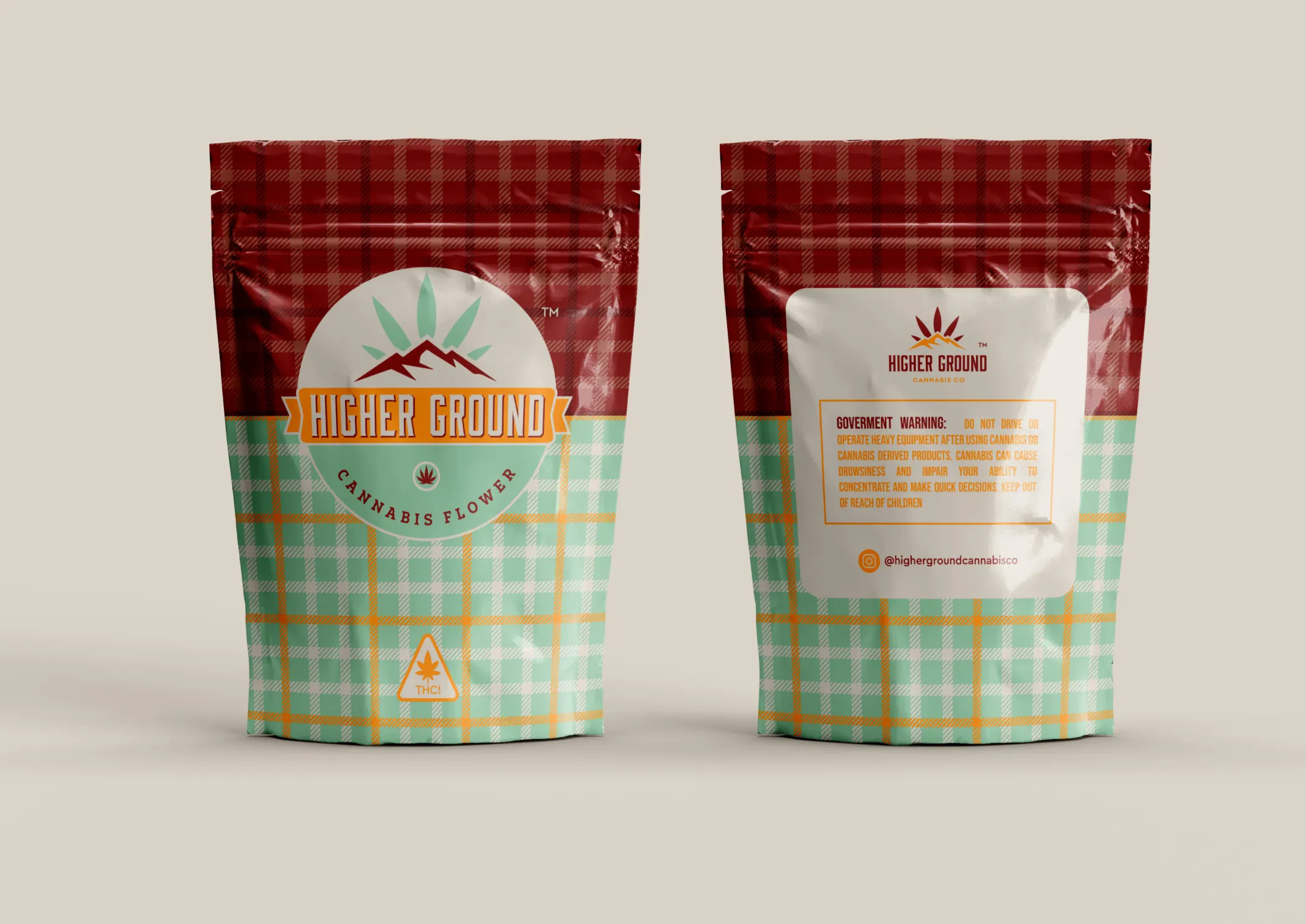
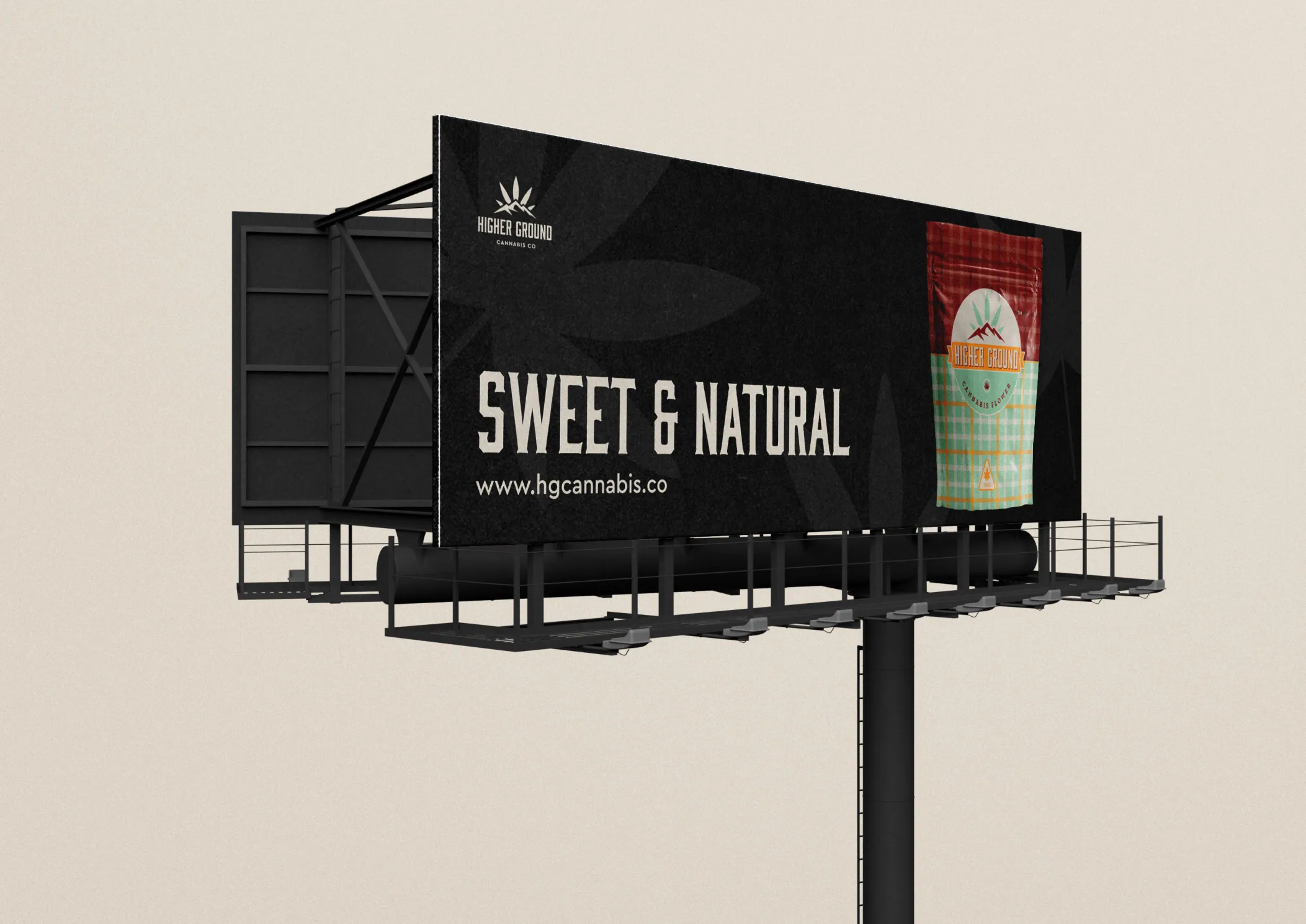
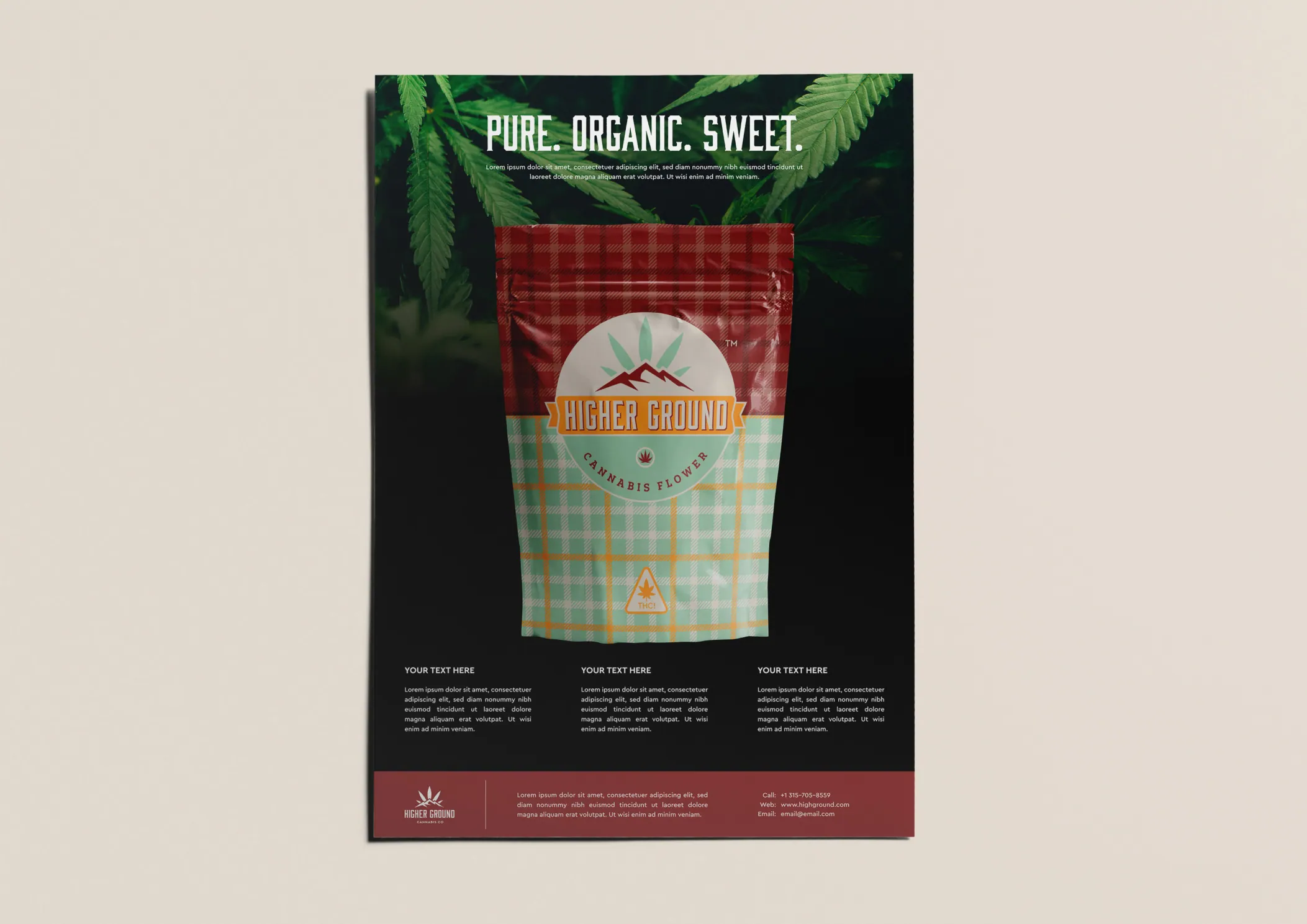
Start with the format. Mylar bags, jars, tubes, and cartons each behave differently. A logo that looks sharp on screen can collapse on a crinkled mylar pouch or wrap awkwardly around a pre-roll tube. For Higher Ground Cannabis we designed the system soil to shelf: a logo set, a three-typeface hierarchy, an earthy palette anchored in sage green and carrot orange, repeating botanical patterns, and the mylar packaging itself. The patterns and palette were built to hold up on the actual material, not just in a mockup.
Then there’s shelf legibility. In a dispensary, a customer scans dozens of products fast. Packaging needs a strong silhouette, a colour you can spot from a metre away, and a name that registers at a glance. Decoration that doesn’t help recognition is wasted space, especially once the compliance panel claims its share of the label.

How important is the name and verbal identity?
The name and voice carry as much weight as the logo, because they’re what a customer repeats and what a regulator scrutinises. Get the verbal identity wrong and no amount of design rescues it.
Cannabis naming is a minefield. Puns date quickly, anything that reads as targeting minors can fail review, and the obvious names are mostly taken or trademarked. A strong name is distinctive, defensible, and says something about the brand’s stance. The voice that surrounds it, on packaging, on the site, in social, has to match. A premium price point paired with a juvenile tone confuses the customer and depresses conversion.
This is positioning work again. Once you know who you serve and what you stand for, the name and voice almost choose themselves. A wellness-led brand for older first-time buyers sounds nothing like a connoisseur flower brand, and it shouldn’t.
How much does cannabis branding cost?
Cost tracks scope, not the cannabis label. A logo and guide sit at the low end; a full identity with packaging, signage, and a social system costs more because there’s more to design.
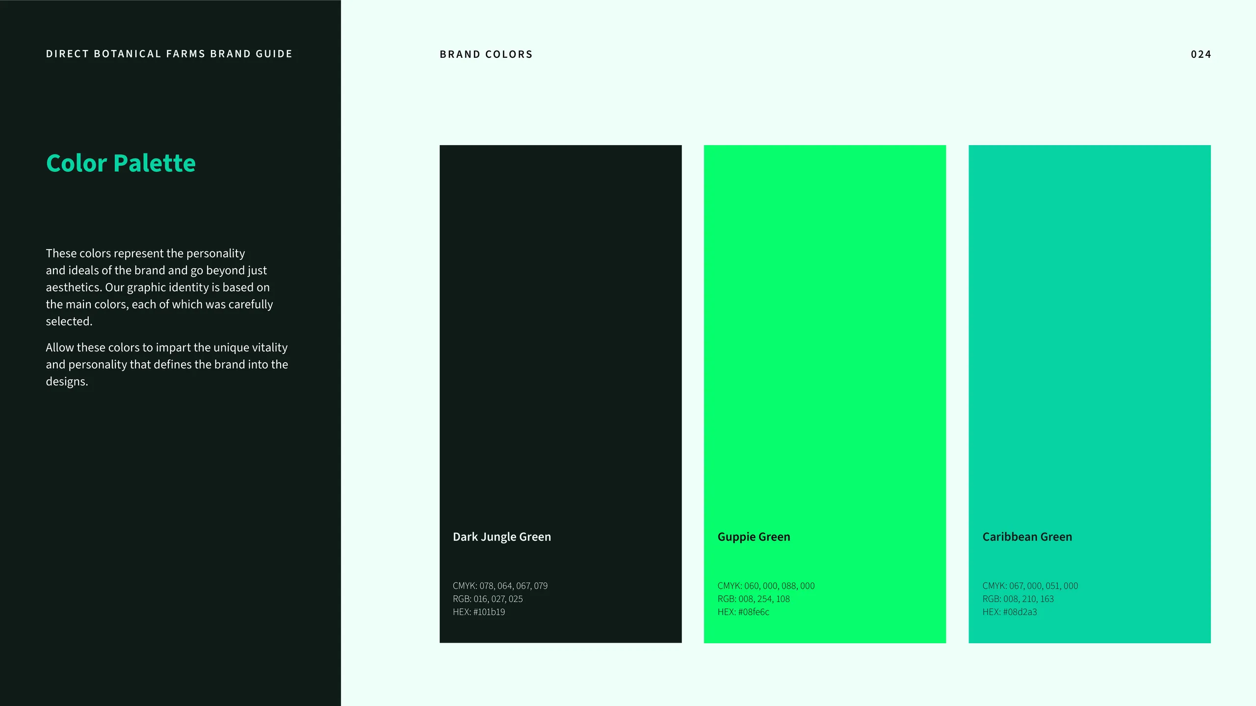
We won’t quote a number that doesn’t fit your scope, because the honest answer is that it depends on what you actually need. A focused logo and brand guide, like the CraftCanna engagement, is a tighter piece of work than a complete system covering identity, packaging, retail signage, and content. Direct Botanical Farms needed the full build: a geometric DBF monogram, a dark green and electric mint palette, a modular pattern library, and an application suite spanning retail signage, social, and digital, because the brand had to hold its ground at retail scale.
What we can tell you is what to weigh the cost against. A cannabis brand that converts pays for itself at the shelf. Across our work the 2.4x average conversion uplift after a rebrand is the number that matters more than the line item. The cheaper question is what a forgettable brand costs you in margin every month it sits next to a sharper competitor.
How long does it take to brand a cannabis company?
A complete cannabis brand can ship in a focused week if the process is built for it. The bottleneck is decision-making, not design hours.
Most agencies stretch cannabis branding across a quarter, and the timeline itself becomes the problem: positioning drifts, stakeholder rounds multiply, the market moves. We run a 7-day sprint instead. Positioning gets locked on day one, the visual identity follows immediately, and packaging and applications come off that foundation. A short clock forces the hard positioning calls before the category swallows them, which is exactly what a shelf this uniform demands.
Speed also gets the brand in-market faster, where it can start earning real shelf feedback instead of internal opinion. For a launching dispensary or a product line racing a licence window, that head start is the whole point.
What should you get out of a cannabis branding project?
You should walk away with a usable system, not a folder of files. That means a logo set, a defined palette and type hierarchy, packaging artwork, and a guide that tells your team and printers exactly how it all behaves.
The deliverable that separates a real brand from a logo purchase is the brand guide. It documents the marks, the colours, the type, the patterns, and the rules, so the brand stays coherent whether you’re printing a mylar bag, building a dispensary sign, or posting to social. Every cannabis project we ship includes that documentation, because a system nobody can apply consistently isn’t a system.
You should also get assets that are production-ready for the formats you actually sell in, with the compliance zones already accounted for. If a branding project hands you a logo and leaves packaging, signage, and the rules as your problem, it stopped halfway.
Where to start
If you’re launching or rebranding, start with positioning and let it drive everything else, then build the identity and packaging as one connected system designed for compliance and the shelf. That’s the through-line in every cannabis brand we’ve built, from CraftCanna to Higher Ground to Direct Botanical Farms.
See how the full process works on our cannabis branding page, then book a free consultation and we’ll tell you honestly what your brand needs before anyone touches a logo.
More from the blog
Beauty branding: how to build a cosmetics brand that sells on shelf and on social
Beauty branding is the system of identity, packaging, and story that makes a cosmetics brand recognizable and worth paying for. Here's how to build one.
Brand sprint vs traditional agency: which rebrand is right for you?
A 7-day brand sprint delivers the same core artefacts as an 8-12 week agency rebrand, at a fixed price. It removes waiting, not work. Here's the honest comparison.

Branding for AI and tech startups: how to look as credible as your technology
Brand an AI or tech startup by making the technology legible, the category clear, and the proof obvious. Here's the playbook we use on every build.