
Restaurant branding: a founder's guide to building a hospitality brand
Restaurant branding is the system that makes a venue recognizable and worth choosing, from the logo to the menu to the signage. Here's how to build one.
Restaurant branding is the system of decisions that makes a venue recognizable and worth choosing before anyone tastes the food: the name, the logo, the colors, the typography, the menu design, the signage, and the voice you use everywhere from the door to the receipt. Done well, it makes a guest trust the experience on sight and remember it well enough to come back and bring people.
Most restaurants get this wrong by treating branding as a logo plus a color or two, then improvising everything else. The result is a venue that looks one way on Instagram, another way on the menu, and a third way on the sign out front. This guide walks through what hospitality branding actually includes, how to keep it consistent across every touchpoint, and how the work changes when you scale from one location to many.
What does restaurant branding include?
Restaurant branding includes everything a guest sees, reads, or feels before, during, and after a visit. It is not the logo. The logo is one asset inside a much larger system.
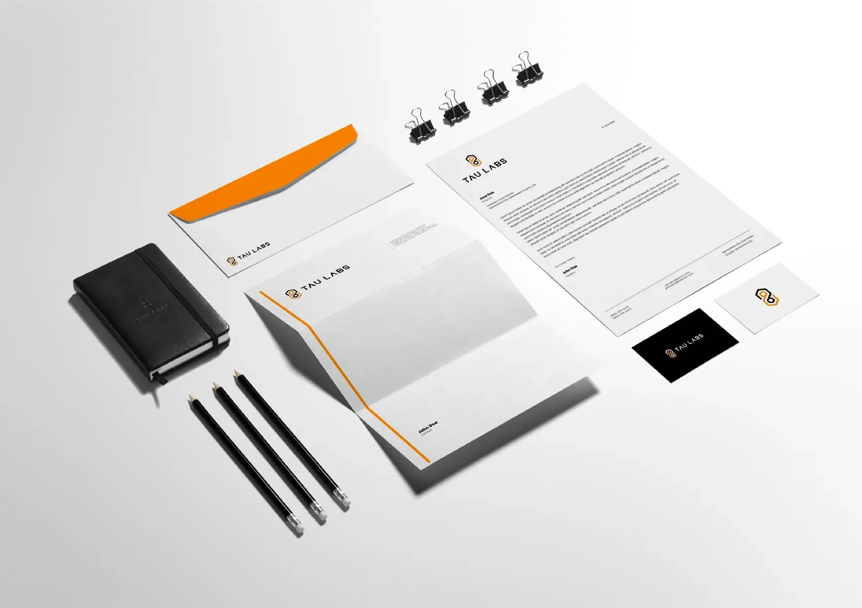
A complete hospitality brand covers the verbal layer and the visual layer. The verbal layer is the name, the tagline, the menu copy, and the tone you use on signage and social. The visual layer is the logo system, the color palette, the typography, the photography style, and the way all of it gets applied to physical and digital surfaces. When Northera builds a hospitality identity, the deliverable is a working kit: primary and secondary marks, a tight color system, a type pairing, and rules for how they show up on a menu versus a window versus a phone screen.
The test of a real brand is whether a stranger could pull three of your touchpoints out of a lineup and know they belong to the same place. A menu, a coffee cup, and a storefront should read as one venue, not three freelancers’ weekend projects.
How do you brand a restaurant from scratch?
Start with positioning, not the logo. Decide who the venue is for and what it stands against before anyone draws a mark, because every visual choice should follow from that answer.
Positioning is a sentence a founder can say out loud: who you serve, what you offer, and why you over the place down the street. A natural-wine bar built for people who find sommelier culture exhausting needs a different identity than a third-wave coffee roaster built for purists. Same category, opposite brands. Get this wrong and the prettiest logo in the world still misfires.
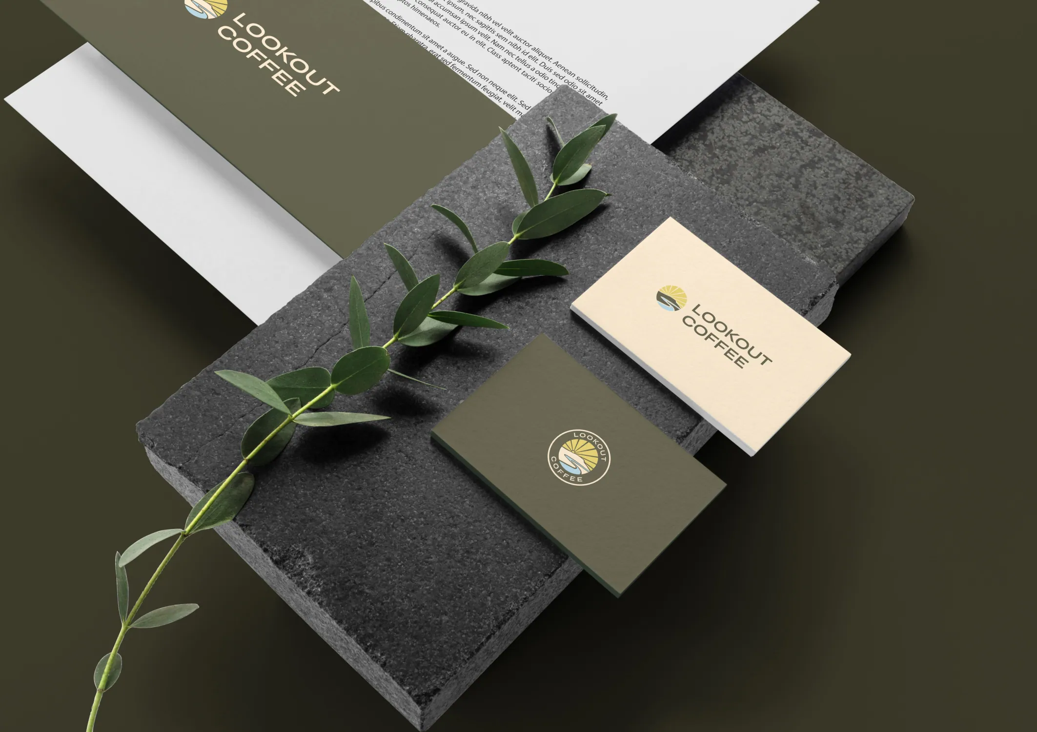
Once positioning is set, the order is: name, then verbal voice, then visual identity, then application. Lookout Coffee is a clean example. The name set the altitude, the deep-olive-and-warm-yellow palette gave it a feeling that reads as outdoorsy and grounded, and the stationery and packaging carried that feeling onto every surface a customer touches. The logo came in the middle of that sequence, not at the start.
If you are working with a studio, the fastest version of this is a seven-day sprint: positioning on day one, visual identity by day two, and applied assets through the rest of the week. We have run that process for 13 hospitality venues, and the pace pins down the menu, the room, and the mark together instead of letting them drift apart across a three-month engagement.
What makes hospitality branding different from other industries?
Hospitality branding has to work in physical space, in low light, in motion, and on a phone, all at once. A SaaS logo lives on a screen. A restaurant mark lives on a backlit sign, an embroidered apron, a to-go cup sweating with condensation, and a tiny Instagram avatar.
That puts unusual demands on the system. The logo needs a version that survives at thumbnail size and a version that holds up etched into glass. The color palette has to look right under warm restaurant lighting, not just on a calibrated monitor. The typography has to be legible on a menu read by candlelight and on a delivery app read on a cracked phone screen.
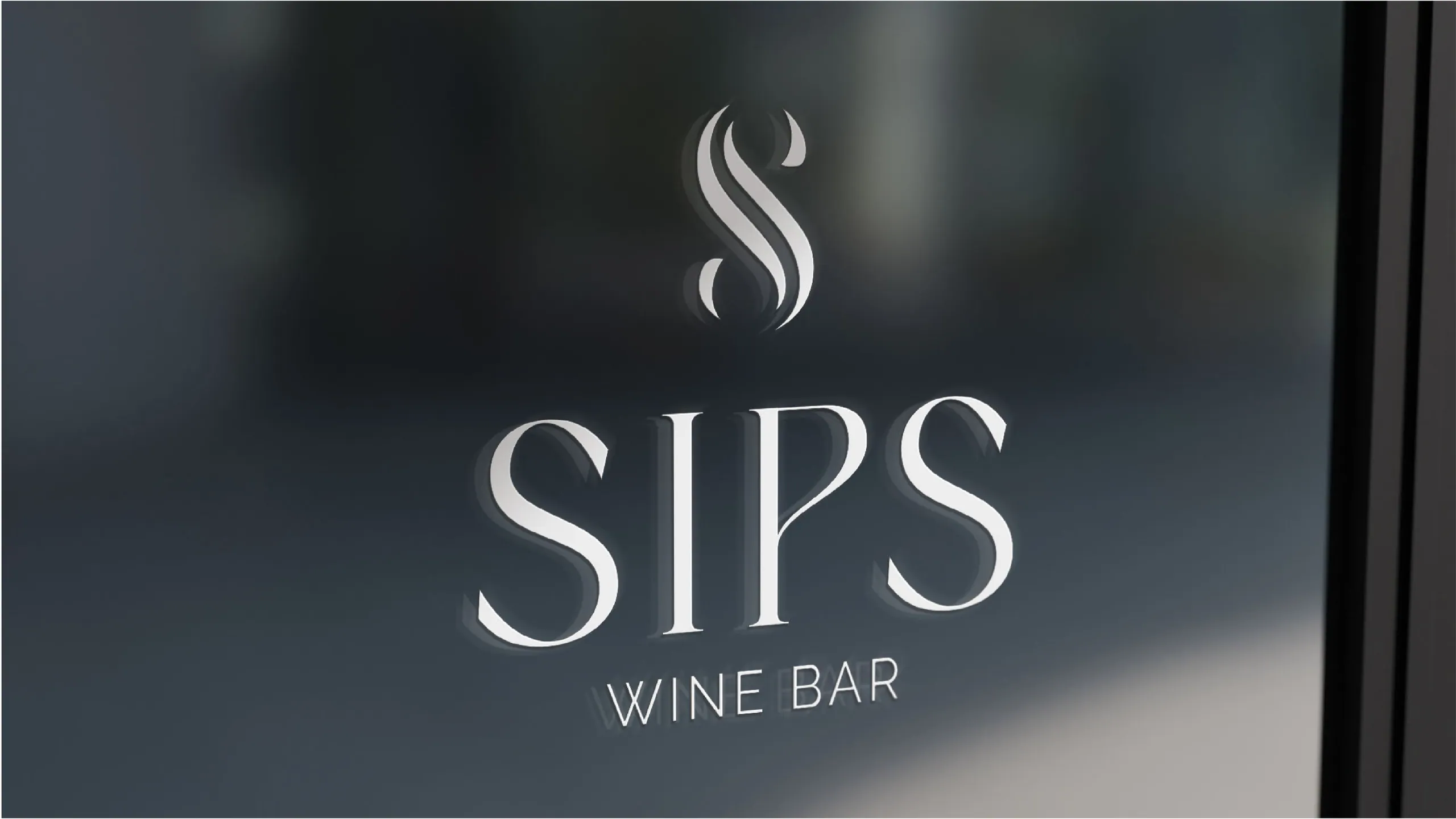
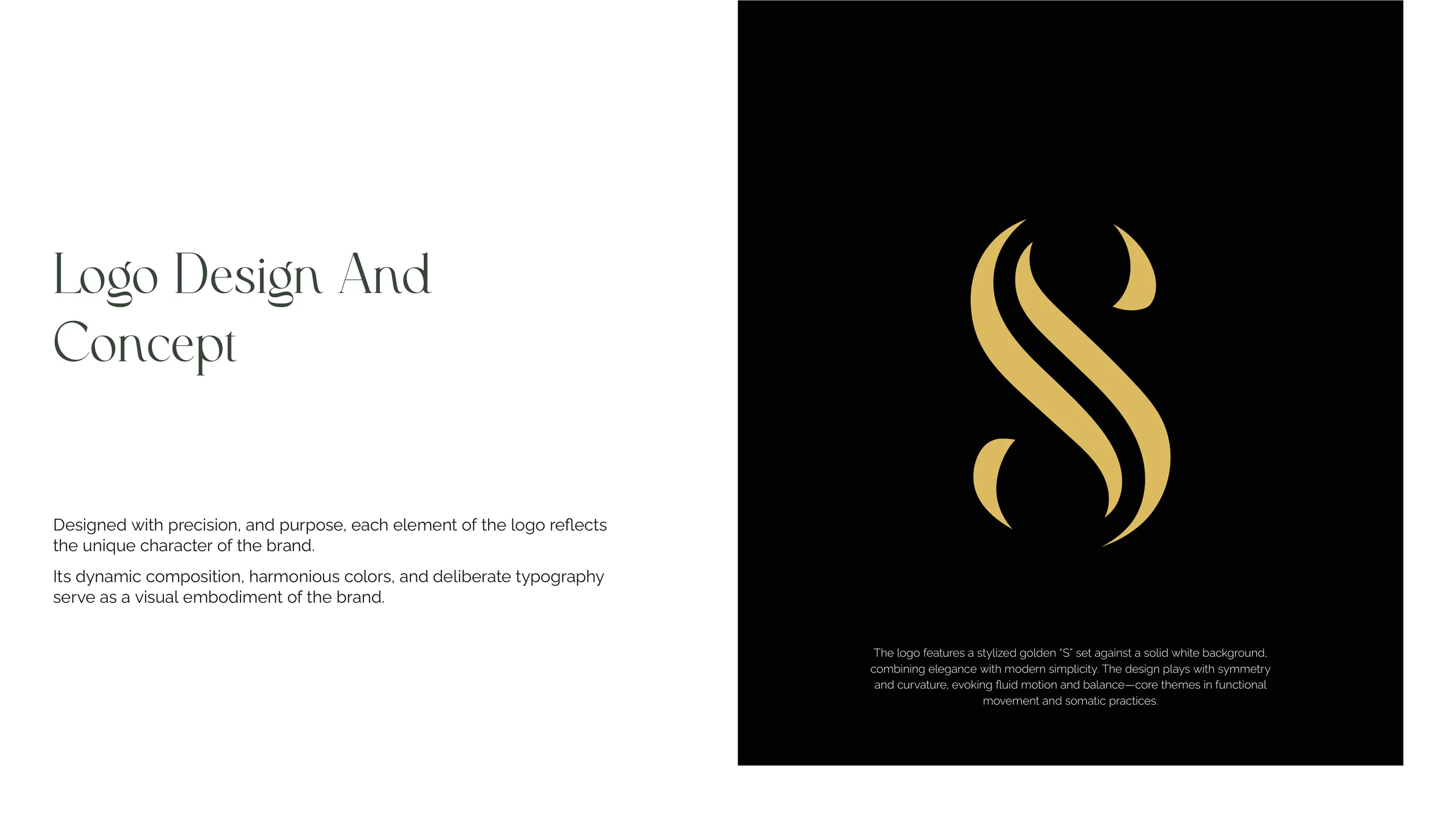
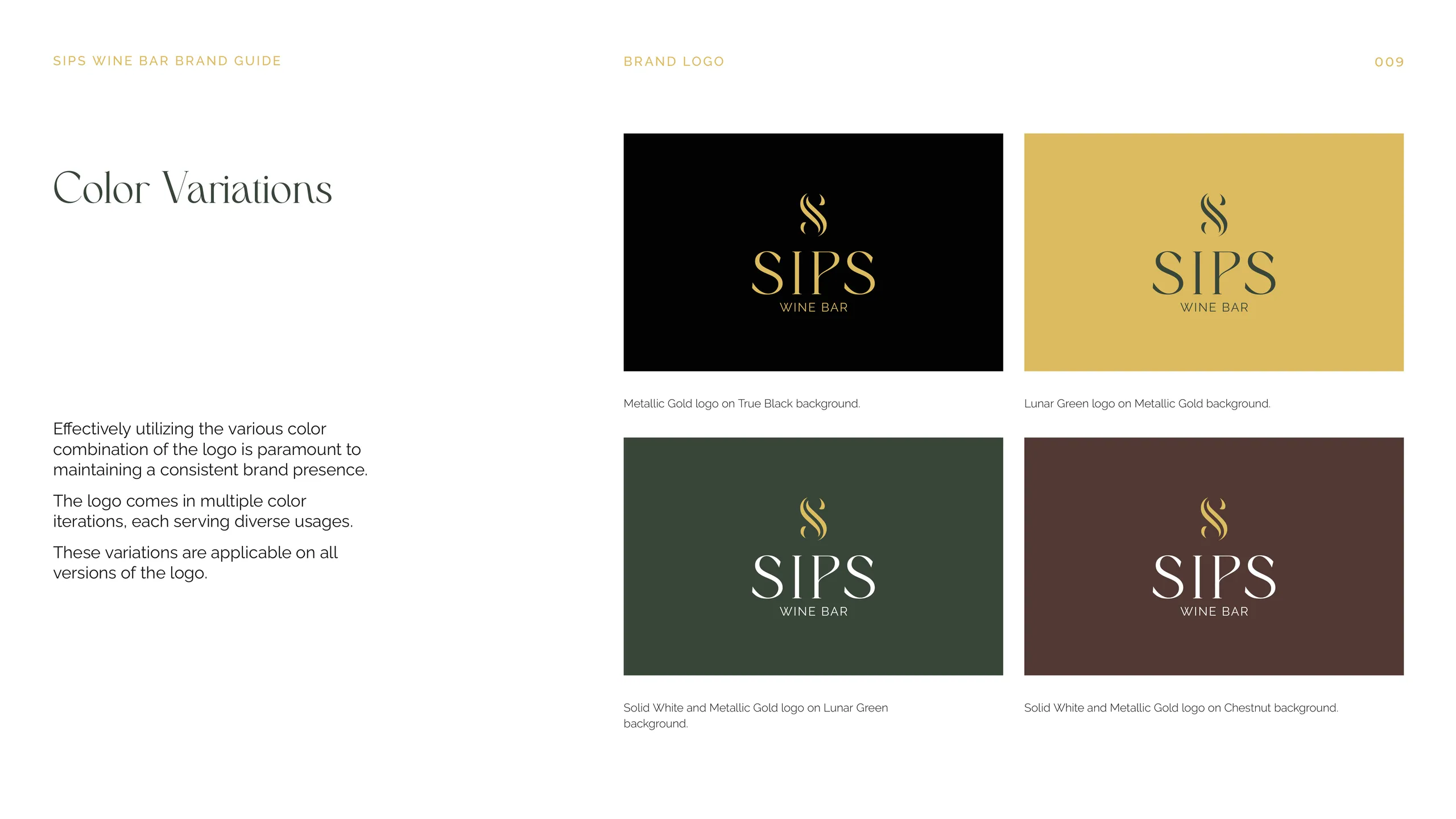
SIPS Wine Bar shows the discipline this takes. The identity runs on gold on true black with a custom monogram, which is a hard combination to keep crisp across surfaces. It works because the system was built for the room first: the mark was designed to hold its weight on a dark wall and a dark menu, then everything else followed from there. Good hospitality branding designs for the hardest physical surface first and lets the easy digital ones fall into place.
How do you keep branding consistent from menu to signage?
Consistency comes from a documented system, not from taste or memory. The moment a sign-maker, a menu printer, and a social manager each improvise, the brand splits into three.
The fix is a brand kit that anyone can apply without calling you. It specifies the exact colors with their print and screen values, the type sizes and pairings, the logo clear-space and minimum sizes, and the rules for photography. With that in hand, the person laying out a new menu and the vendor cutting the window vinyl pull from the same source instead of guessing.
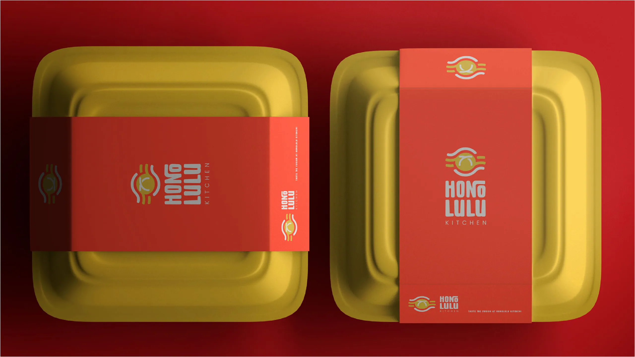
Honolulu Kitchen is built this way. The Hawaiian-Asian fusion concept runs on a custom wordmark and a sunrise-and-bowl icon across a red, gold, and black palette, with guidelines that hold the look steady whether it lands on a takeout bowl, a storefront, or a social post. The guidelines are the product. The logo is just the most visible part of it.
A simple working rule: before any new asset goes out, hold it next to two existing ones. If it does not obviously belong to the same family, the kit is being ignored or the kit is incomplete. Both are fixable, and both are cheaper to catch before printing than after.
How do you brand a multi-location concept?
Build the brand as a system with a fixed core and flexible edges, so each location feels like the same concept without feeling stamped from a template. The mark, the palette, and the voice stay locked. The application can flex to the room and the neighborhood.
The mistake operators make is one of two extremes. Either every location is identical down to the wallpaper, which kills the local feel that makes a neighborhood spot work, or every location does its own thing, which means there is no brand at all, just a shared name. The answer is in the middle: a strict core identity plus a defined set of moves a new location is allowed to make.
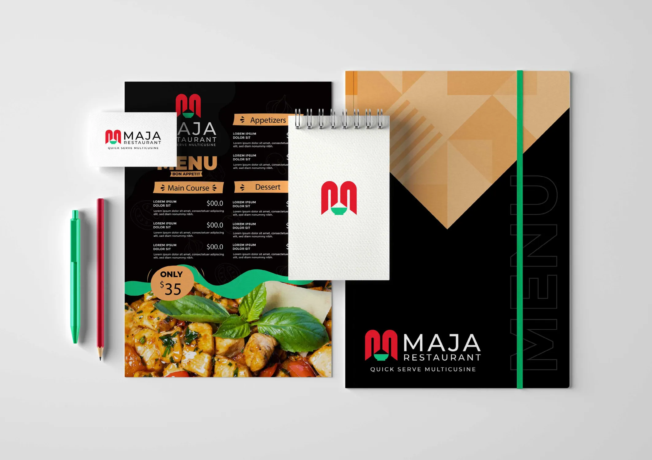
Maja Restaurant was built with that scalability in mind. The geometric M-mark and the sharp red, green, amber, and black palette give a quick-serve concept a fixed visual core, while the system leaves room for the menu and the space to adapt as the concept grows. When you brand for one location but design for ten, the second location costs a fraction of the first because the hard decisions are already made.
How much does restaurant branding cost, and how long does it take?
Cost tracks scope, and timeline tracks process, not the other way around. A logo-and-colors job and a full hospitality identity system are different products at different prices, and a clear process can compress the timeline without cutting the work.
A traditional agency runs a restaurant rebrand over two to three months: kickoff, moodboards, multiple concept rounds, stakeholder reviews. A focused sprint runs the same scope in a week by front-loading the decisions and parallelizing the execution. We have shipped full hospitality identities in seven days, which gets the venue in-market earlier and earns real customer feedback instead of internal debate. Across 1,000+ brands since 2018, the projects that ship fast are the ones where the founder makes positioning calls early and stays available.
The return shows up in behavior. A coherent brand reads as a venue worth trusting, and that trust converts: clarity at the point of decision is part of why our work averages a 2.4x conversion uplift. For a restaurant, the point of decision is the storefront, the menu, and the delivery-app listing, and branding is what makes the guest choose you in the half-second they spend looking.
What’s the first move if your restaurant brand isn’t working?
Audit your touchpoints against each other before you redesign anything. Lay your sign, your menu, your cups, and your social grid side by side. The gaps tell you whether you have a brand problem or an application problem.
If the pieces look like different venues, you have a system problem and need a real identity built from positioning up. If the pieces are fine on their own but the venue still feels forgettable, you have a positioning problem, and a new logo will not fix it. Either way, the work starts with the same question every hospitality brand has to answer: who is this for, and why here instead of next door?
If you want that answered properly, tell us about your venue. We build hospitality branding as a complete system, on a timeline that gets you back to running the restaurant.
More from the blog
Beauty branding: how to build a cosmetics brand that sells on shelf and on social
Beauty branding is the system of identity, packaging, and story that makes a cosmetics brand recognizable and worth paying for. Here's how to build one.
Brand sprint vs traditional agency: which rebrand is right for you?
A 7-day brand sprint delivers the same core artefacts as an 8-12 week agency rebrand, at a fixed price. It removes waiting, not work. Here's the honest comparison.

Branding for AI and tech startups: how to look as credible as your technology
Brand an AI or tech startup by making the technology legible, the category clear, and the proof obvious. Here's the playbook we use on every build.